The Numeric Input Field in Fluent Forms allows users to input numbers in a controlled format. It’s ideal for collecting numerical data like phone numbers, age, salary, or other numerical details.
This article will guide you through adding the Numeric input field in your Fluent Forms for your WordPress Site.
Adding Numeric Input Field #
To learn how to add the Numeric input field to the Fluent Forms, follow the steps with the screenshots below –
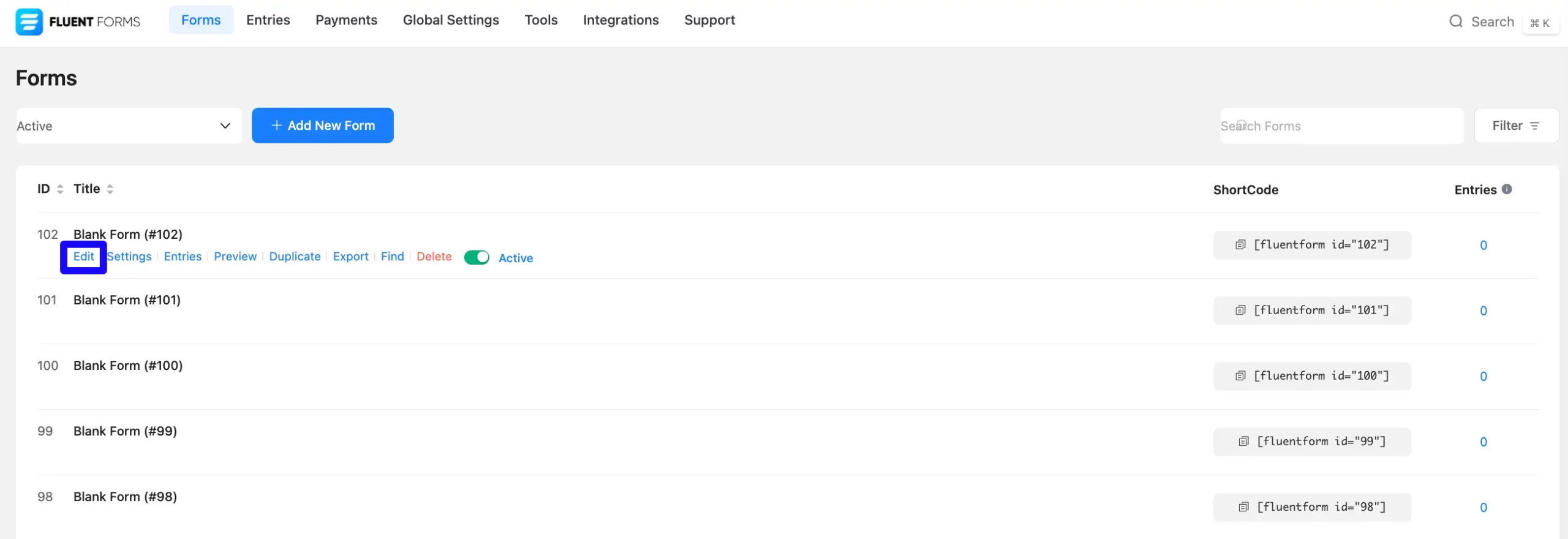
First, go to the Forms section from the Fluent Forms Navbar, choose a desired Form, and click the Edit icon to open the Editor page of that form.
If you do not have any existing forms, read Create a Form from Scratch or Create a Form using Templates documentation to create a new one.
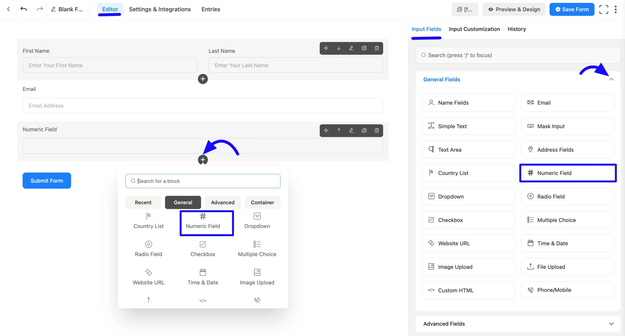
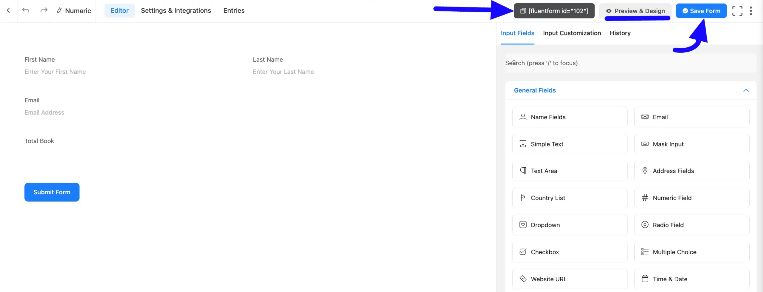
Once you are on the Editor page, click the Plus Icon in your form editor and open the General Fields module. The General Fields option is also in the right sidebar under the Input Fields tab.
Now, choose the desired Numeric Field field by clicking on it or Drag & Drop it into your editor.
Customizing the Numeric Input Field #
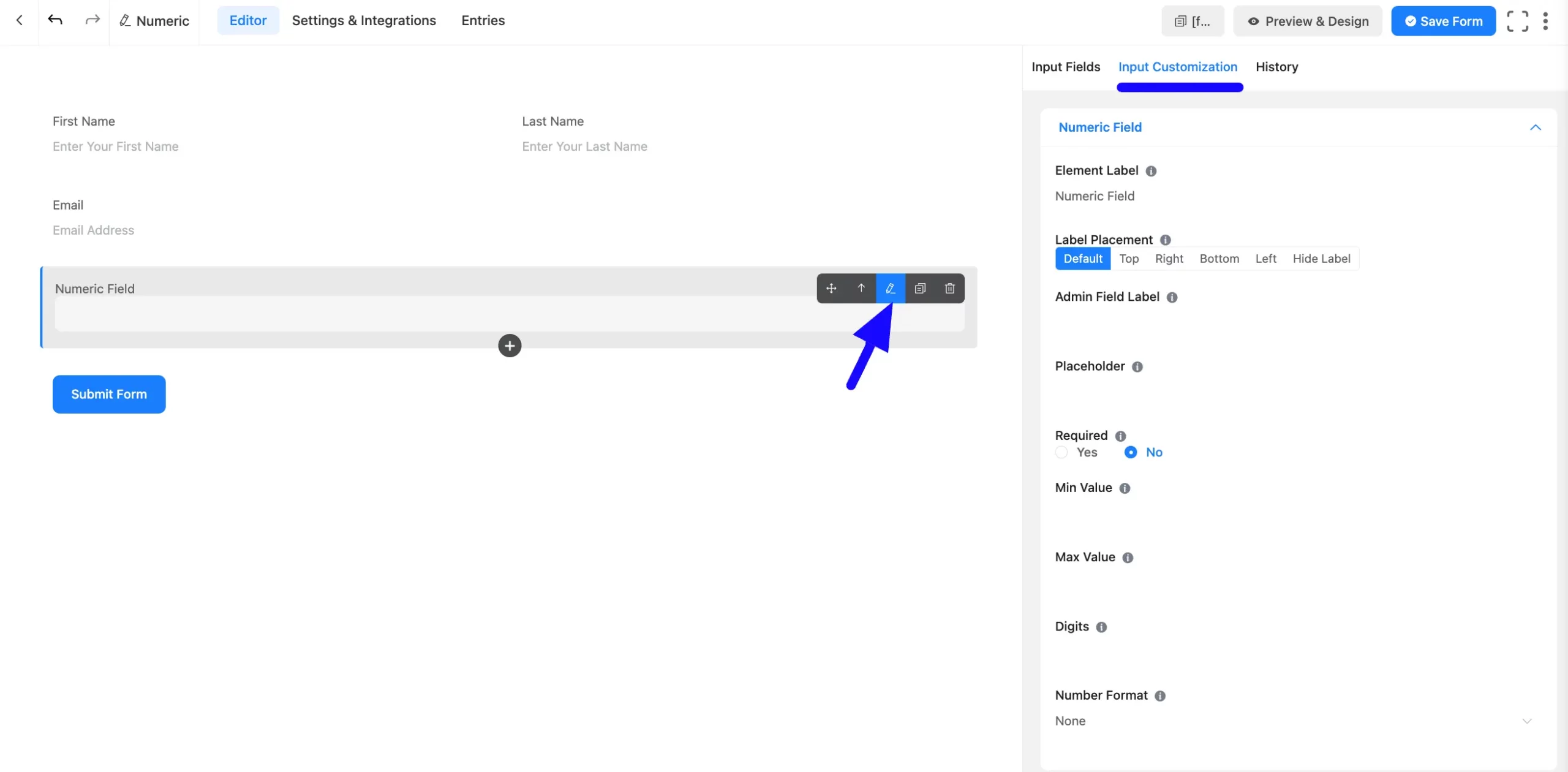
After adding the field, you can customize it. Hover over the field and click the Pencil Icon to open the Input Customization tab. It will take you to the Input Customization tab on the right side and offer the following options for customizing the field.
- Numeric Field Options
- Advanced Options
Numeric Field Options #
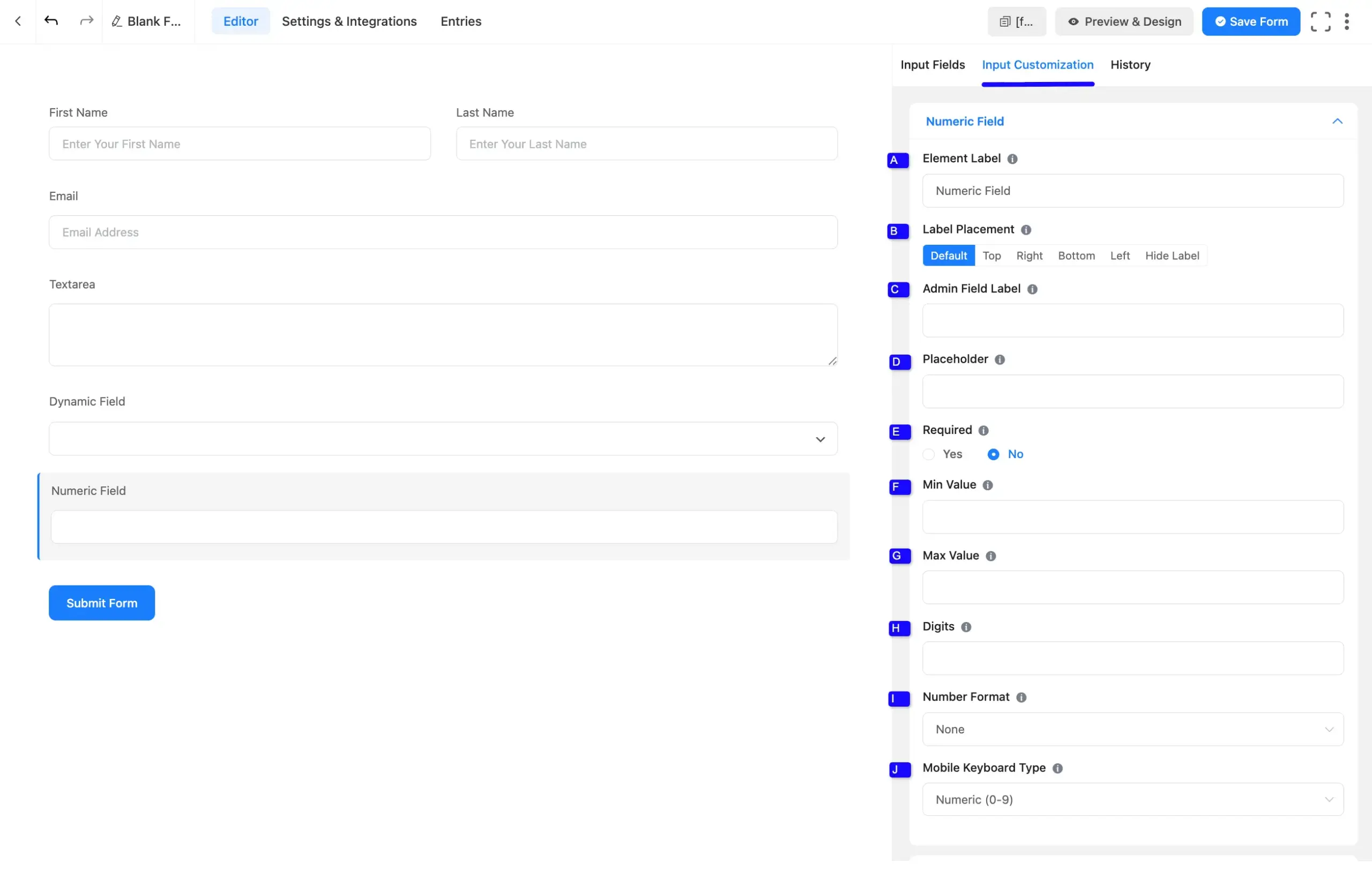
You will find various settings options for customizing the field. Located in the Input Customization Tab, these options allow you to configure essential aspects of the Numeric input field.
All the Settings under the Numeric Field mentioned above are briefly explained below –
A. Element Label: This is the field title the users will see when filling out the Numeric field in a form. You can enter any text here to help users understand the purpose of the field.
B. Label Placement: This option allows you to determine the position of the label title where the user will see it. The available options are Top, Left, Right, and Default. All of those are self-explanatory except the Default. If you select the Default option, it will represent your global label placement settings.
C. Admin Field Label: The admin field label is a field title displayed only to admin users. This means that you can configure this option to show a different field label for your admin users when they view the form submissions.
D. Placeholder: When the input field is empty, a message is usually shown to the users so they can understand what the field expects from them. This is the equivalent of the HTML input placeholder attribute.
E. Required: Choose the appropriate option from here to determine whether the field should be empty when the user submits your form.
F. Min Value: You can define a minimum value to be allowed in the input field. Users will not be allowed to enter a smaller number than the defined value, which is already set as a minimum number. Set the error message to be shown when a smaller number is submitted.
Example: For age, set a minimum value of 18.
G. Max Value: You can also define a maximum value that your users cannot exceed. Set an error message to be shown when a number exceeding the determined maximum value is submitted.
Example: For years of experience, set a maximum value of 40.
H. Digits: You can set the number of digits for the input field. If validation fails for Digits, an error message will be shown.
I. Numeric Format: You can select the format of numbers allowed in this field. You can use a comma or a dot as a decimal separator. Both EU and US-style with or without commas and dots are available.
J. Mobile Keyboard Type: Select the specific keyboard layout that will appear for mobile users when they tap this field. Options include:
- Numeric (0-9): Displays a standard number pad.
- Decimal (0-9 with .): Displays a numeric pad with a decimal point.
- Telephone (0-9, *, #): Displays a dialer pad.
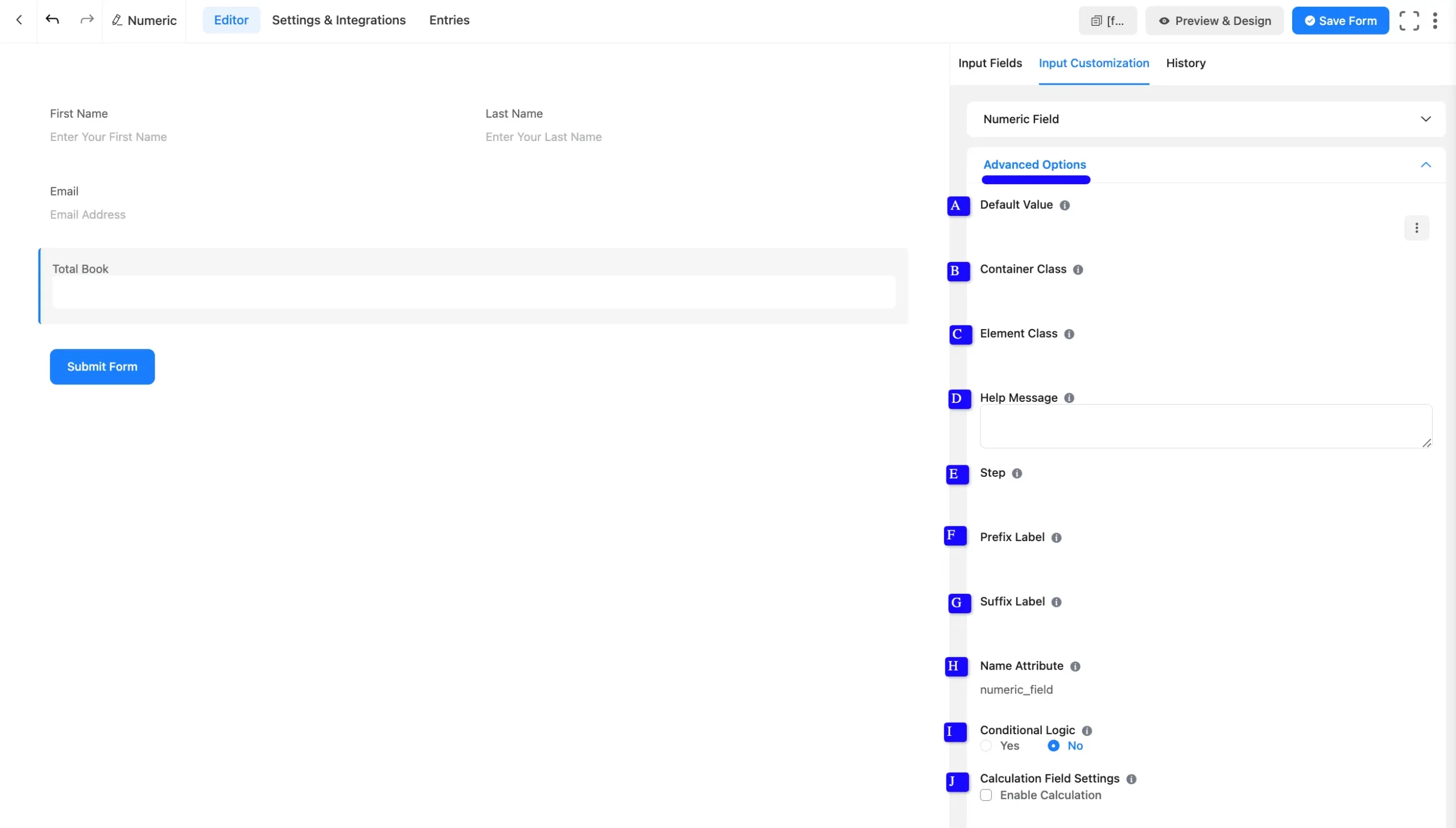
Advanced Options #
Advanced settings allow further customization to meet specific use cases. All the Settings under the Advanced Options tab mentioned in the screenshot are briefly explained below –
A. Default Value: Using our shortcodes, you can manually set any fixed value in your field and pre-fill your input field dynamically. Read this article to better understand Dynamic Default values.
B. Container Class: Use this option to add your custom CSS classes to the field’s wrapper.
C. Element Class: Add custom CSS classes to the input field.
D. Help Message: This option allows you to guide your user thoroughly. Add your text here, which will be shown as a help message to the user.
E. Step: The user can provide a Step attribute for this field. Users can give the value any floating value. For example:
- Use 1 for whole numbers ( 1, 2, 3).
- Use 0.01 for decimal steps ( 0.01, 0.02, 0.03).
F. Prefix Label: You can use this field to provide a Prefix Label in your input field. It will show in the input field as a prefix label.
G. Suffix Label: You can use this field to provide a Suffix Label in your input field. It will show in the input field as a suffix label.
H. Name Attribute: The input field’s name attribute is the HTML equivalent of the same name. You don’t need to modify this.
I. Conditional Logic: This option allows you to create specific rules to dynamically hide/show the input field to function conditionally based on your submission values according to your set of conditional logics. To learn more, read this Documentation.
J. Calculation Field Settings: Enable this to dynamically calculate the field’s value based on other numeric field values. Add a formula expression to implement calculations. To learn more about numeric calculations, please read this article.
Embedding the Form on Your Website #
Once you complete the customization, click the Save Form button to save all your changes. Click the Preview & Design button in the middle to see the form preview.
To integrate and display the form on a specific page or post, copy the Shortcode from the top right side and paste it into your desired Page or Post.
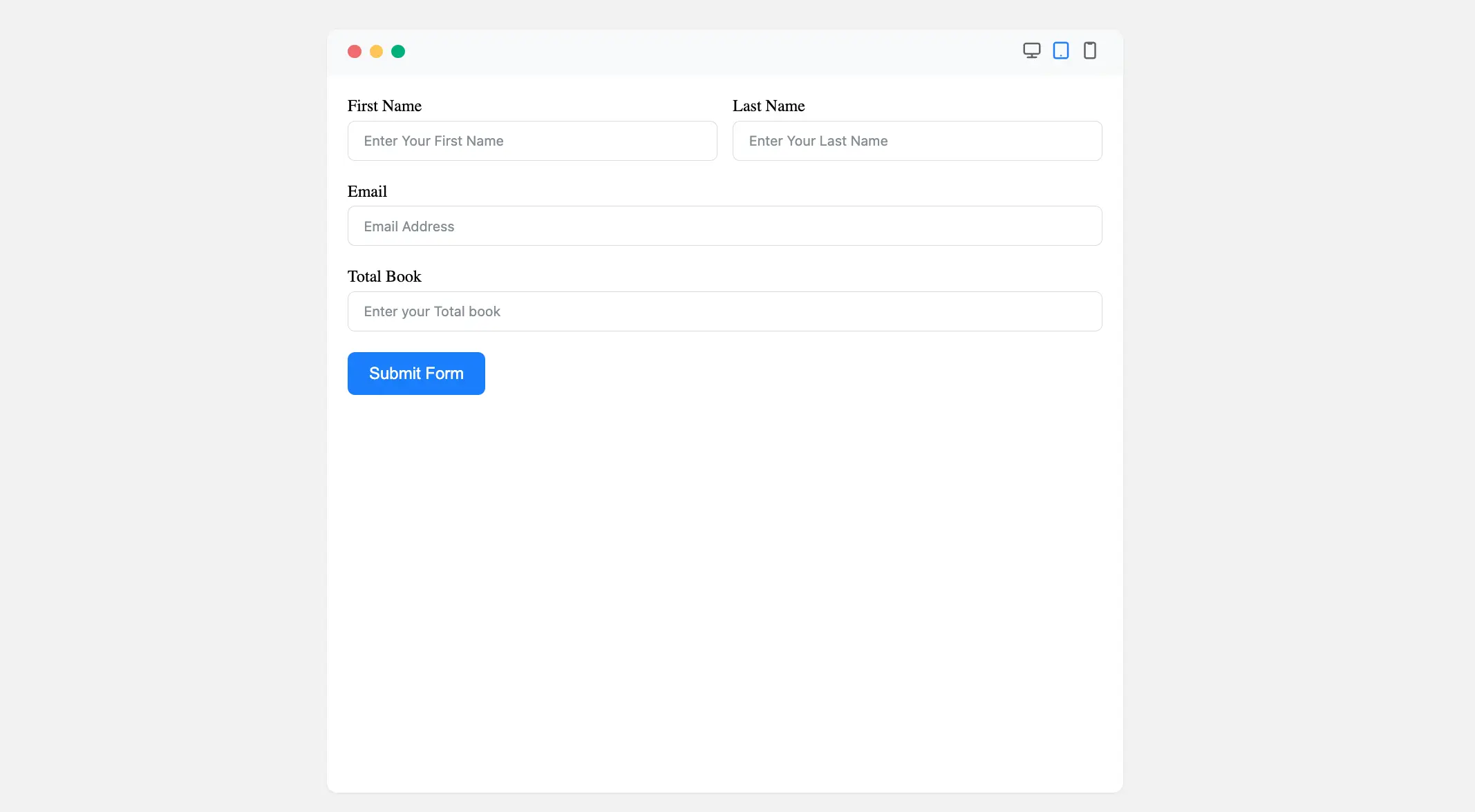
Preview of Added Numeric Field #
Here is the preview of the added Numeric field under the Form.
With these configurations, your Numeric Input Field is ready to capture precise numerical data from users!
If you have any further questions, concerns, or suggestions, please do not hesitate to contact our support team. Thank you.


