Fluent Forms is designed to look great & fit with any WordPress theme. With the built-in Form Styler, you can easily create a custom design that perfectly matches your site’s branding without coding knowledge.
Form Styler is a Pro feature. To use it, make sure you have Fluent Forms Pro.
This guide walks you through how to design, style, and customize your forms visually in Fluent Forms.
Getting Started with Form Styler #
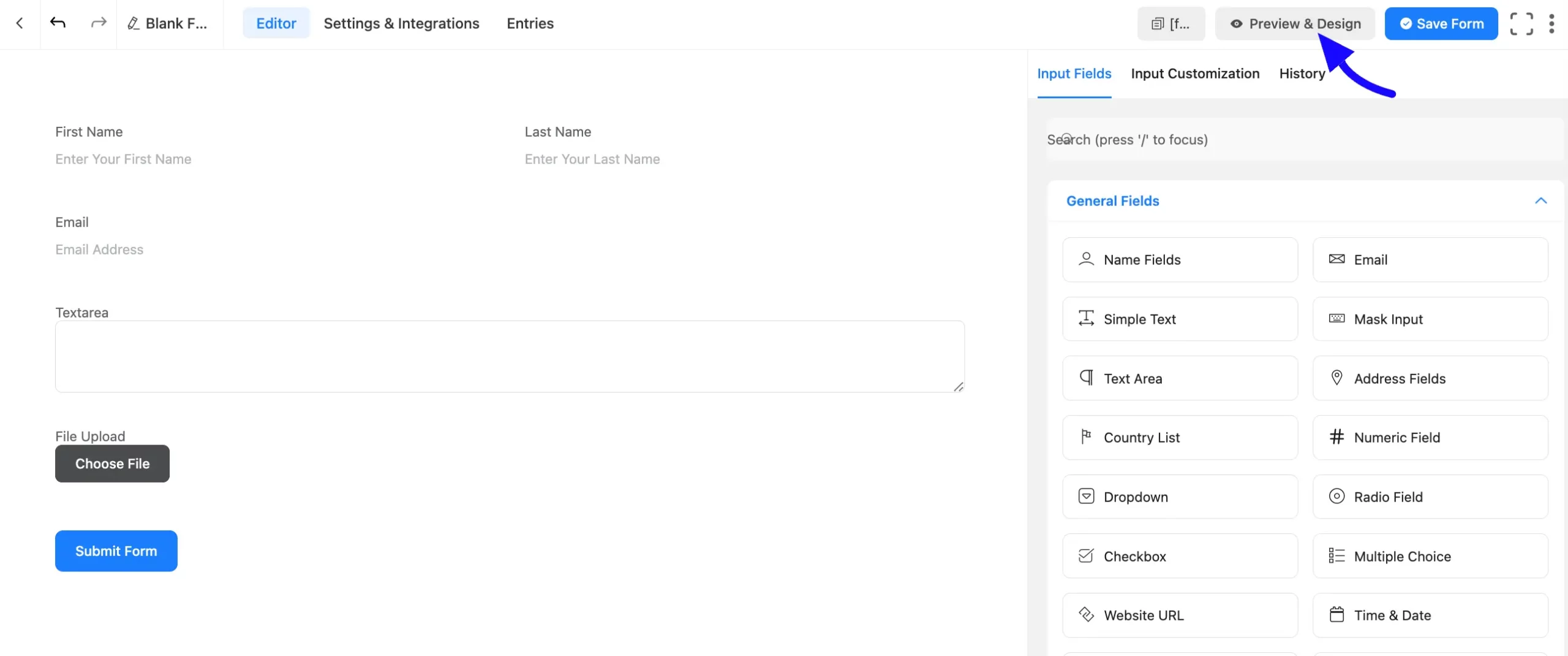
First, open or create a form in Fluent Forms. Save the form, then click Preview & Design in the top-right corner to open the styling panel.
Styling Options #
There are three tabs for the design part of the Fluent form.
General Tab #
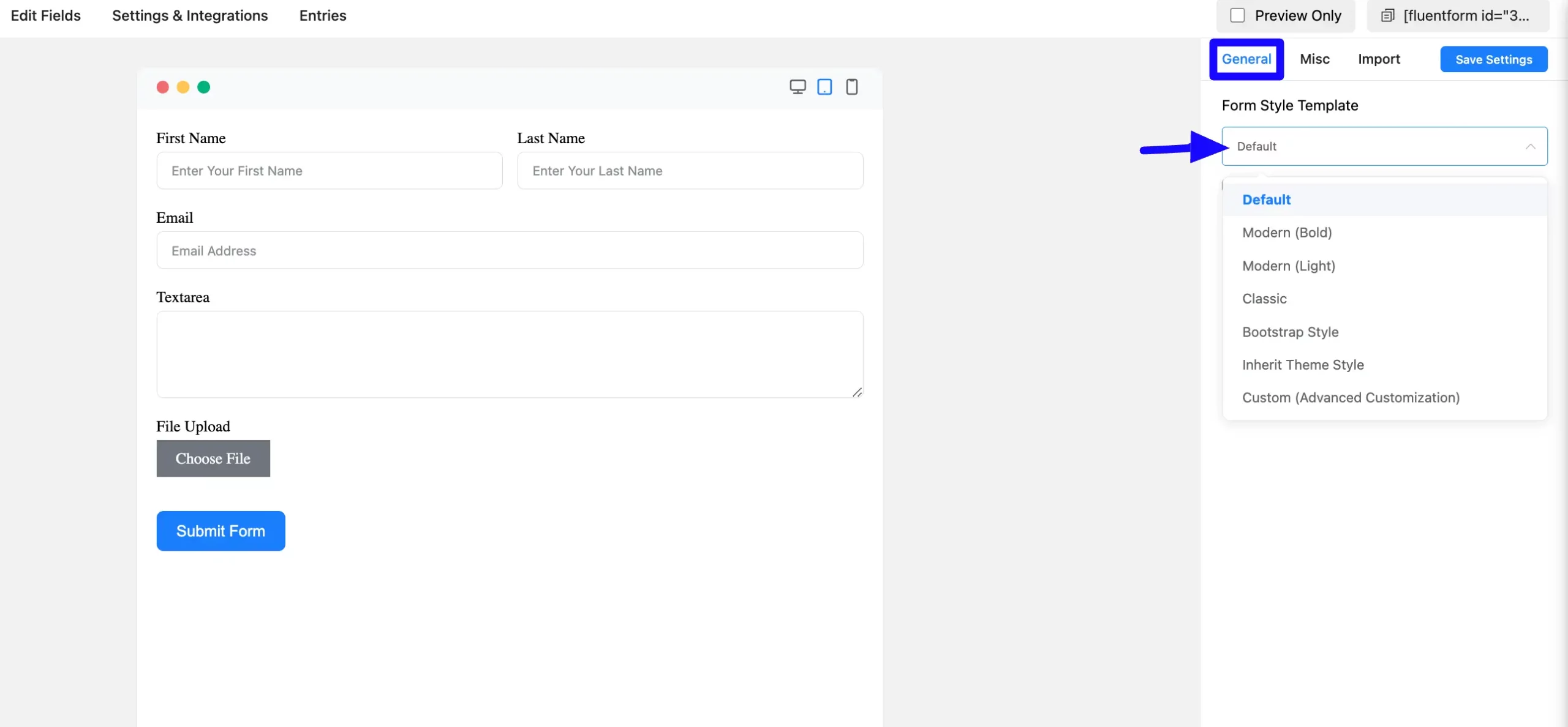
The General Tab is used to style each element of the form. Here you can choose some pre-defined styles from Form Style Templates.
There are different style sets to choose from. Default, Modern Bold, Modern Light, Classic, Bootstrap Style, and Inherit Theme Style are all Form Style Template.
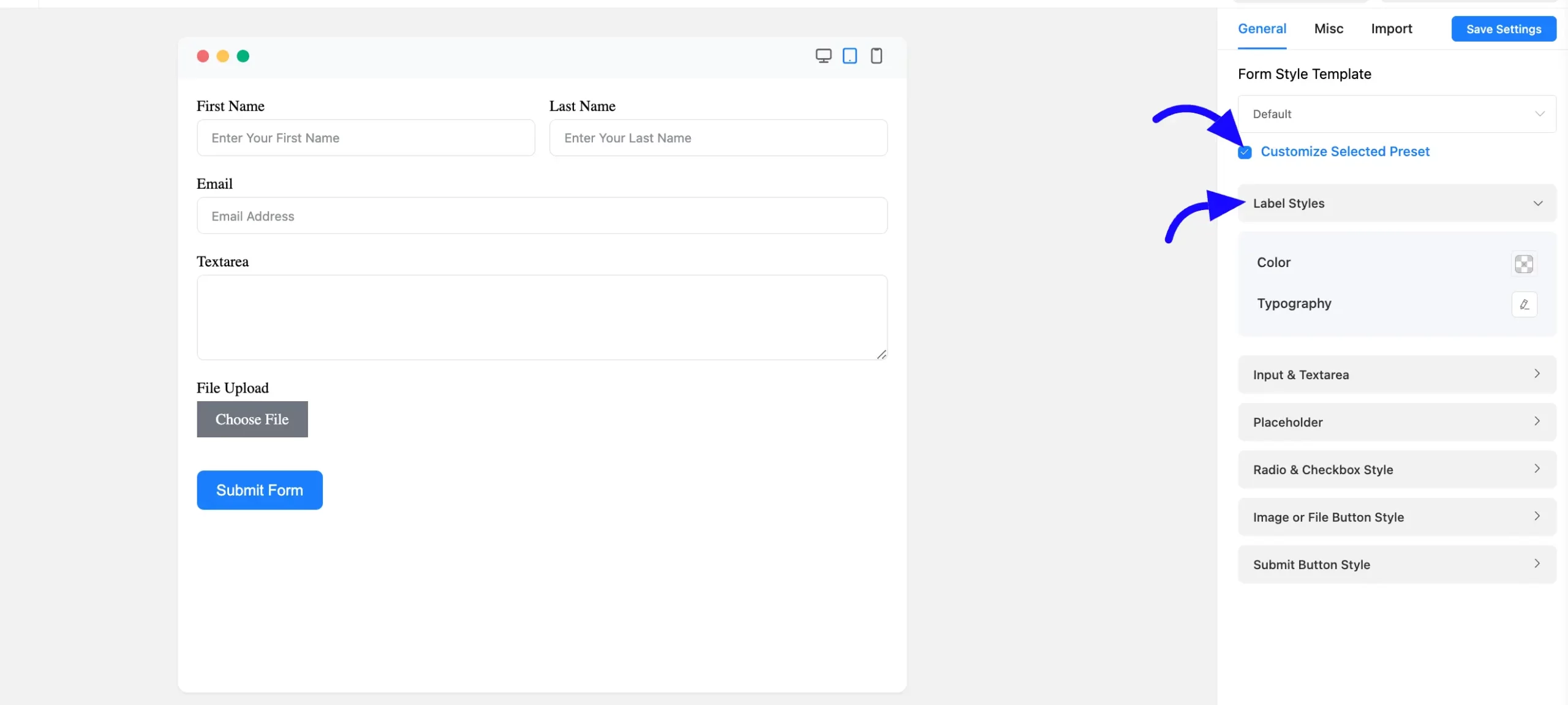
You can also Customize the preset by choosing the Custom (Advanced Customization) option. From this option, you can change the Label Styles, Input and textarea styles, Placeholder styles, Radio and checkbox Styles, and Submit Button styles.
Label Style: You can change the color of the field labels. As shown in the screenshot below, you may also define typography, such as font size, font weights, text decoration, line height, and letter spacing.
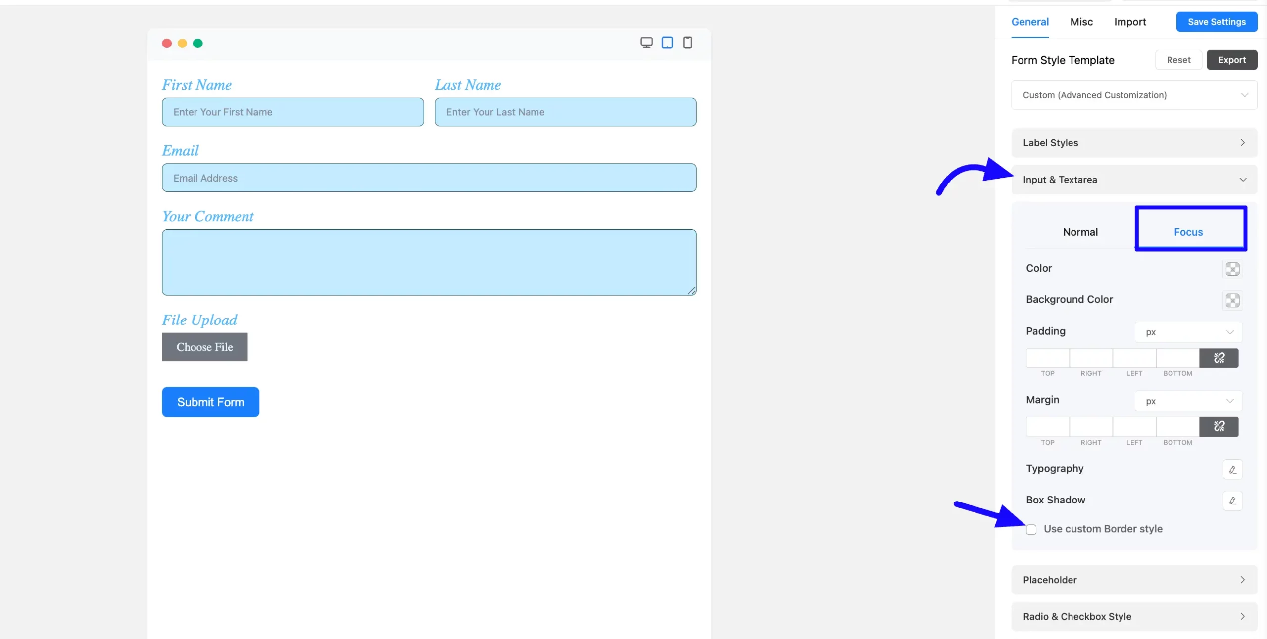
Input & Textarea Styles: Set the input fields and text areas with background and text colors. Change the font size, weight, text decoration, line height, letter spacing, etc. The box shadow of the input and text-area boxes can be defined below the Typography settings.
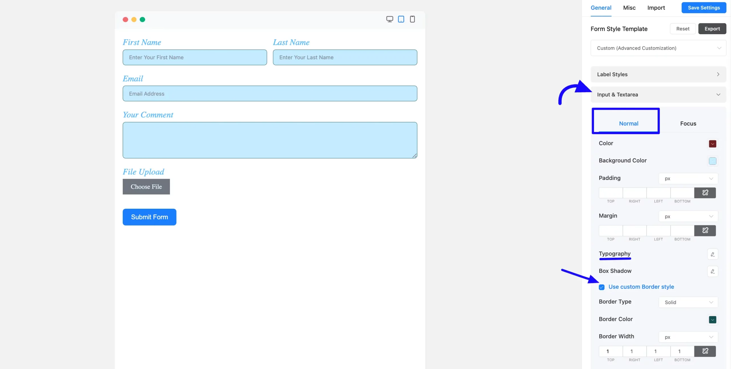
When clicking on Focus, you can add style to the input fields and text regions. This is the same as the standard styling options.
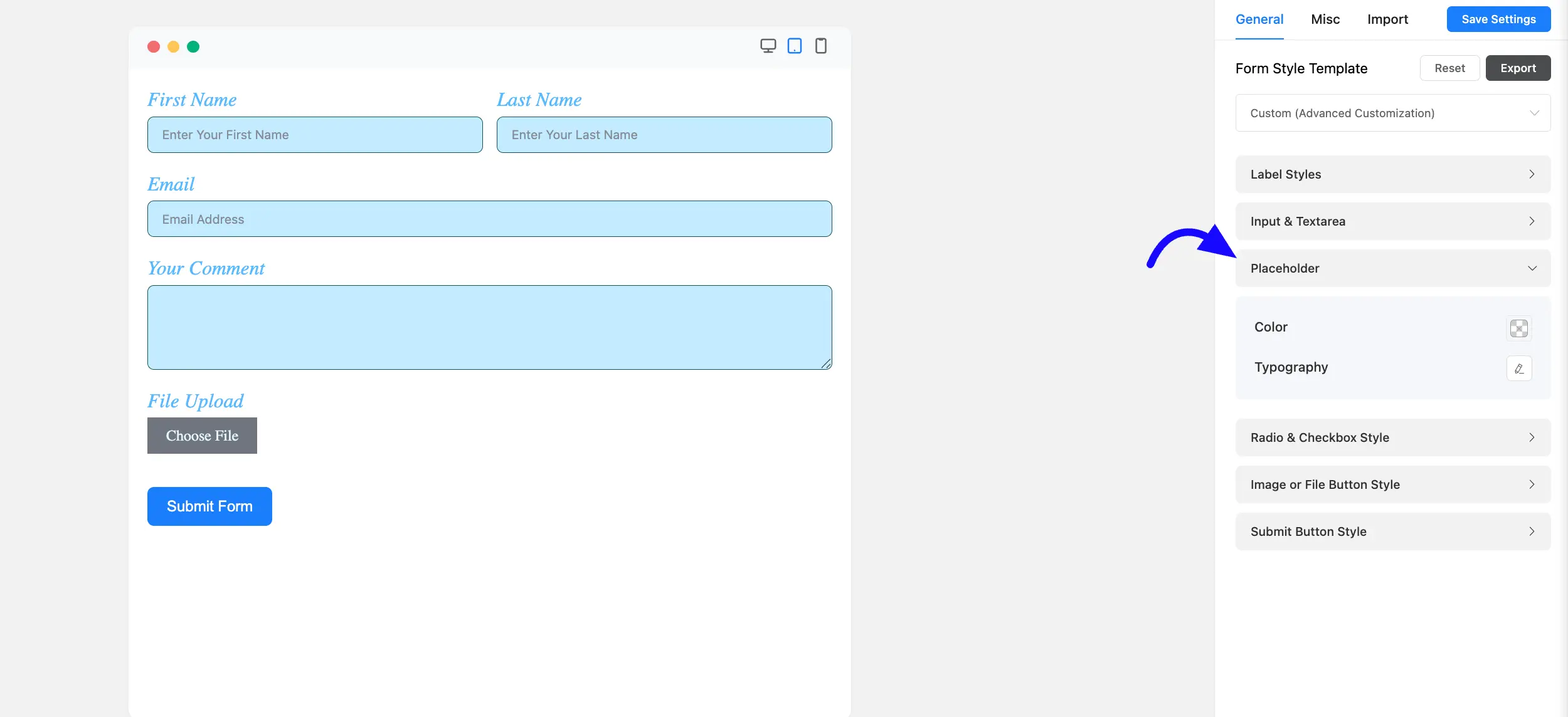
Placeholder Styling: Choose the color of the input field placeholders. Set the typography as indicated in the screenshot, which includes Font Size, Font Weights, Text Decoration, Line Height, and Letter Spacing, among other things.
Radio & Checkbox Style: When you enable Smart UI, you’ll see three styling options for the radio and checkbox fields. When the radio or checkbox is checked, define the border, item, and background colours.
You can also style your form with Custom Border by checking the Use Custom Border Style.
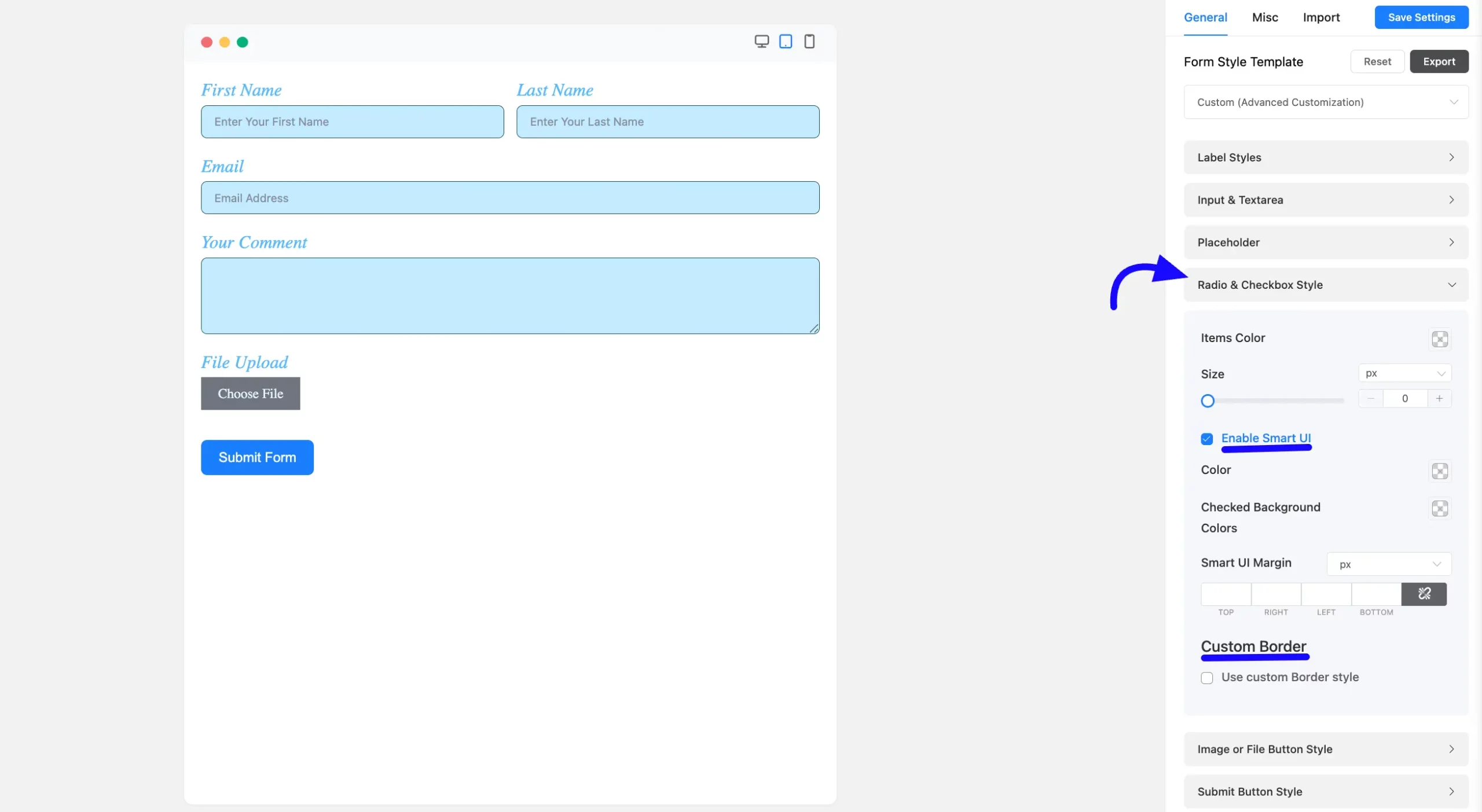
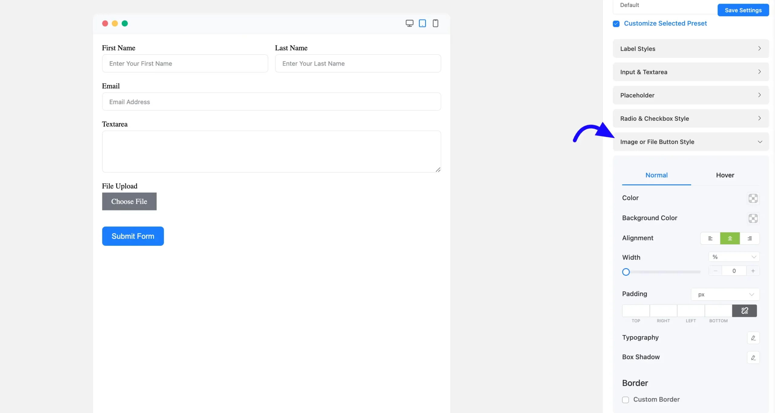
Image or File Button Style: Fluent Forms offers the Image or File button Style options. You can customize the button to match your website’s design.
You can personalize the button’s background color, text color, typography, border options, and even add box shadows.
These customizations can be applied to both the Normal state and the Hover state.
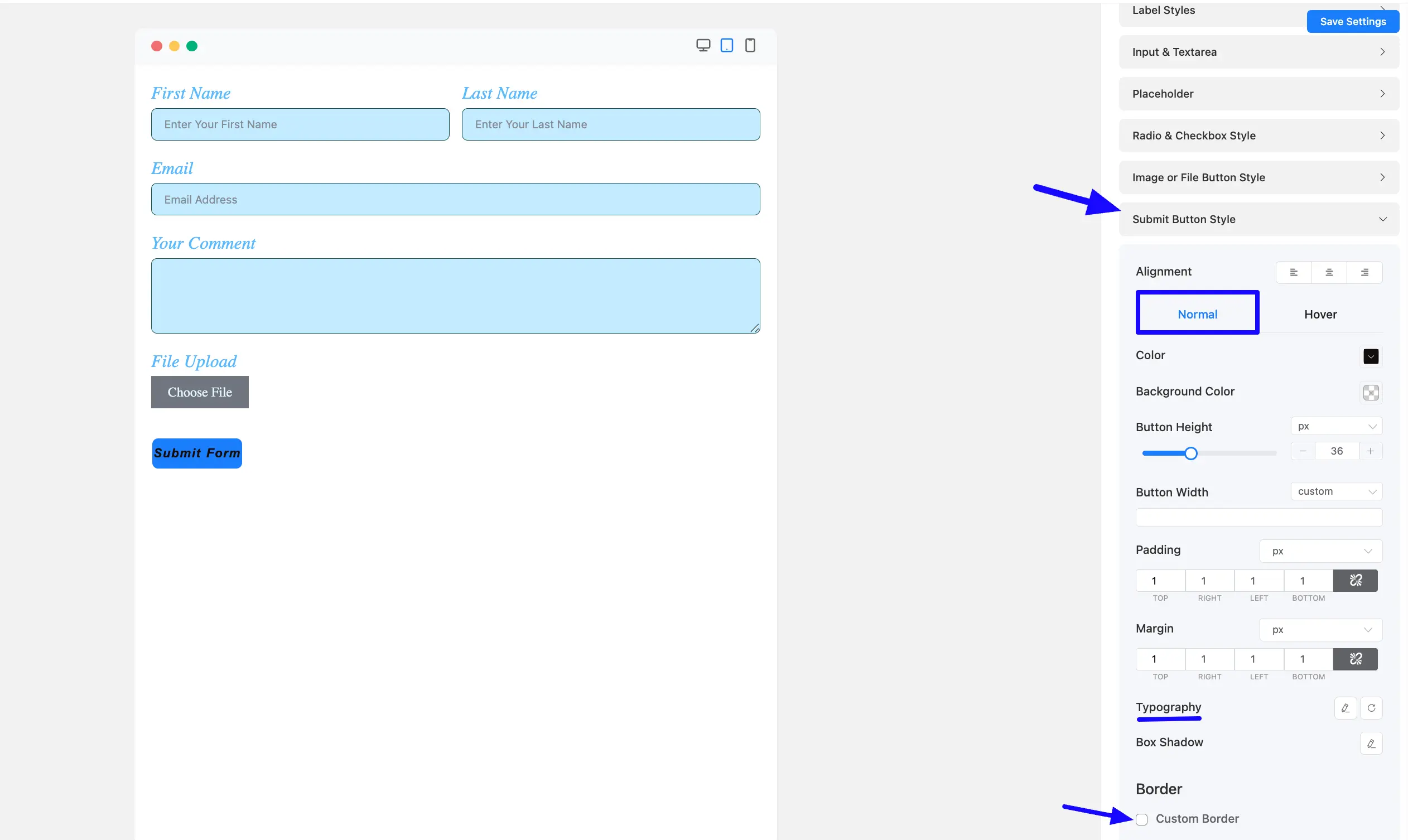
Submit Button Style: Fluent Forms sets the default Submit button color to a vibrant dodger blue. However, you’re not restricted to this; you can easily customize the Submit button to suit your preferences and match your website’s design.
The styling options for the Submit button are the same as those for the Next and Previous buttons in multi-page forms.
You can personalize the button’s background color, text color, typography, border options, and even add box shadows.
These customizations can be applied to both the Normal state and the Hover state.
Misc Tab #
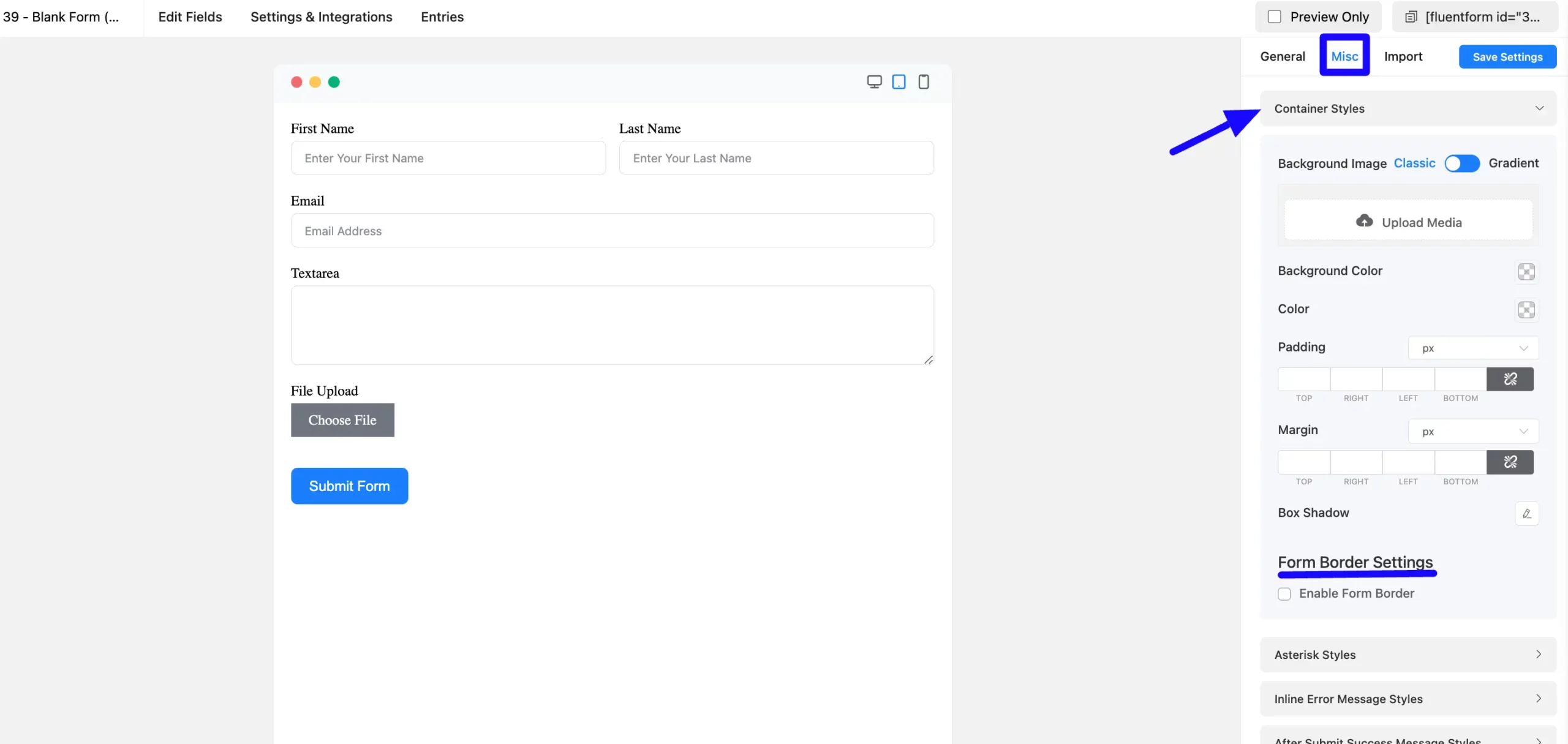
The Misc Tab styles the Form Container background, padding, and margin.
Container Style: In the container style options, you can choose various design options, including background, borders, padding, margin, box shadow, etc.
Form Border Settings: Enable form border settings and specify the border type, color, width, and radius of the border.
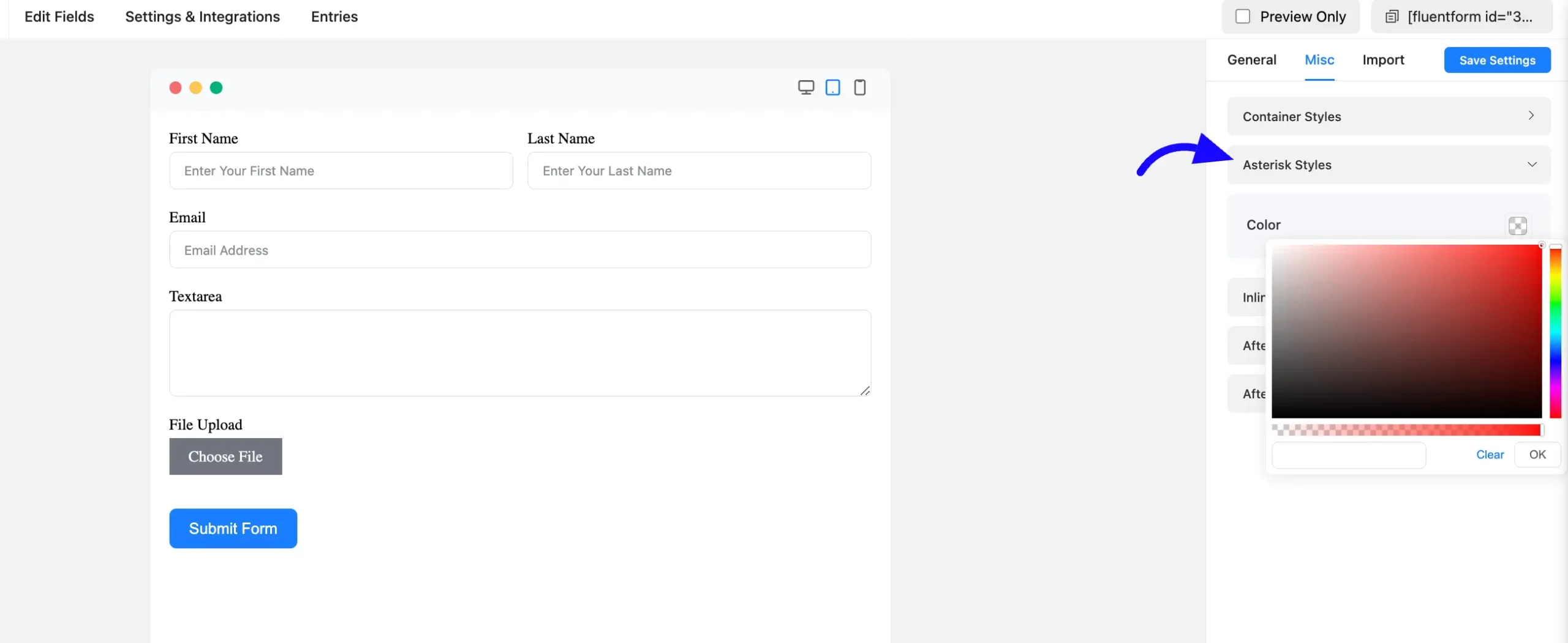
Asterisk Styles: You can choose the color of the asterisk styles of your form here.
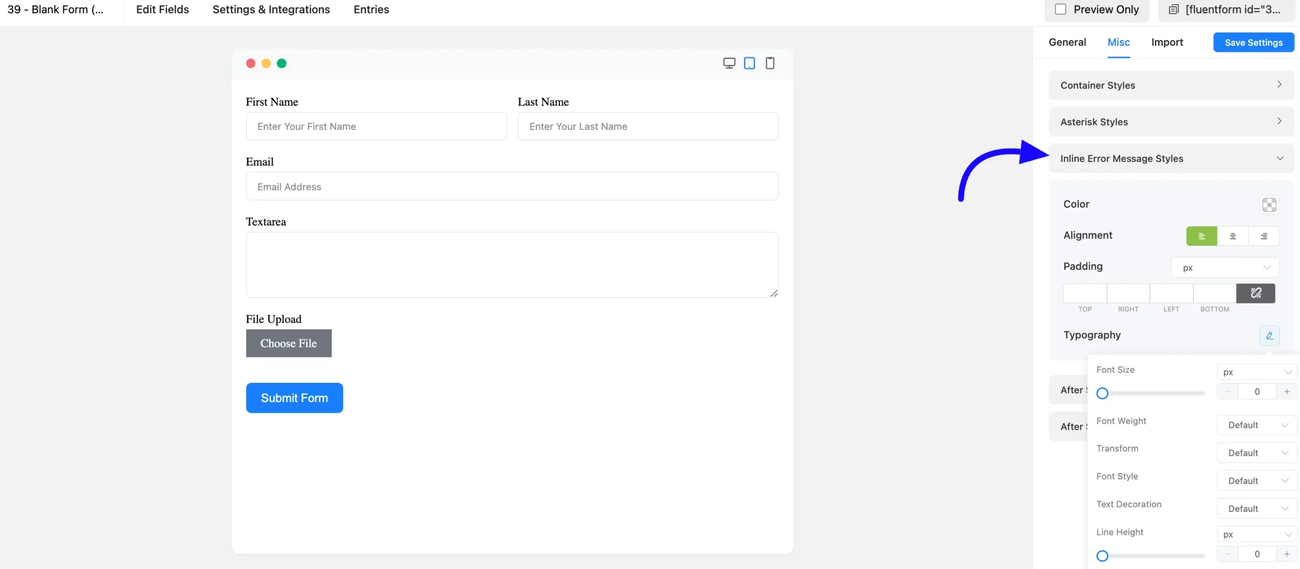
Inline Error Message Styles: The color of the Inline Error Message is customizable. As shown in the screenshot below, define the typography, including font size, font weights, text decoration, line height, and letter spacing, among other things.
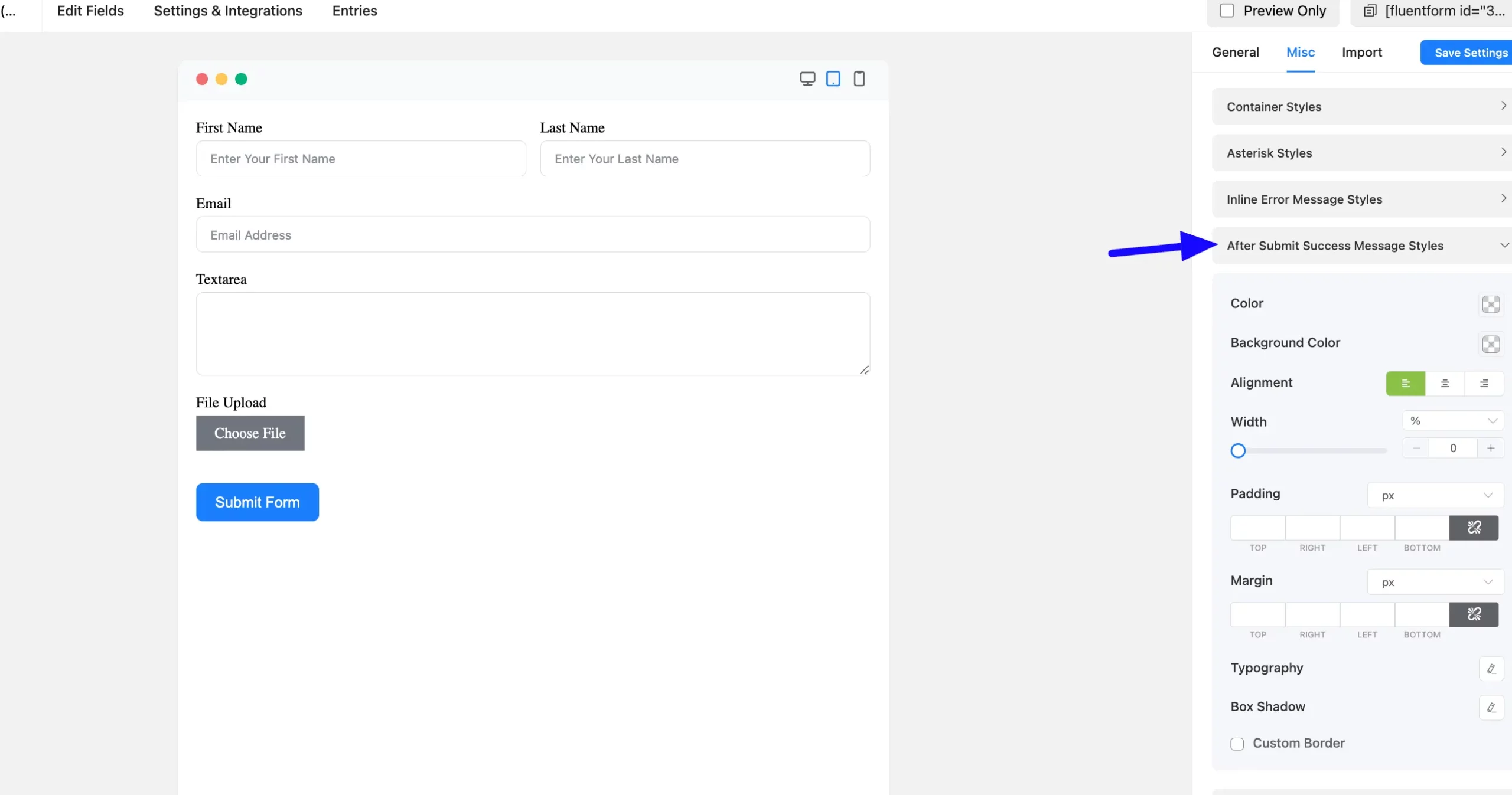
After Submit Success Message Styles: You can also easily customize the After Submit Success Message. Fill out your form and submit it for visual viewing while designing the submit success message for testing purposes.
You can customize the background and fonts. You can change the Font Size and weight, Text Decoration, Line Height, and Letter Spacing, among other things.
The box shadow of the success message box can be defined under the typography settings.
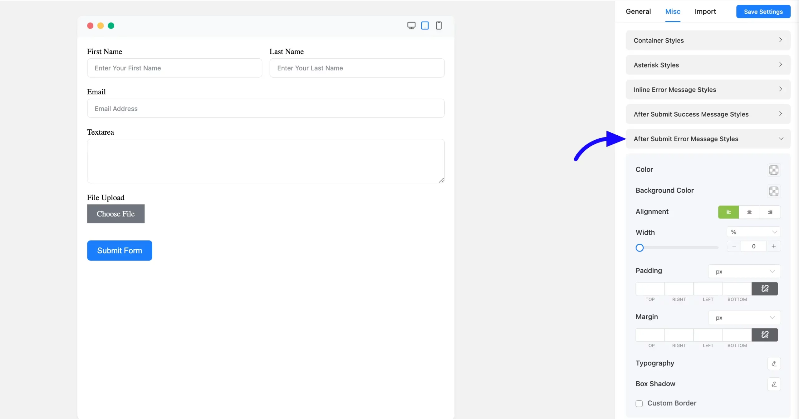
After Submit Error Message Styles: The Error Message can also be customized after submission. Its styles are the same as the After Submit Success Message Styles.
You can set the background and font colours, as well as the font size, weight, text decoration, line height, and letter spacing.
You may also configure the box shadow of the success message box and also add a Custom Border in your form.
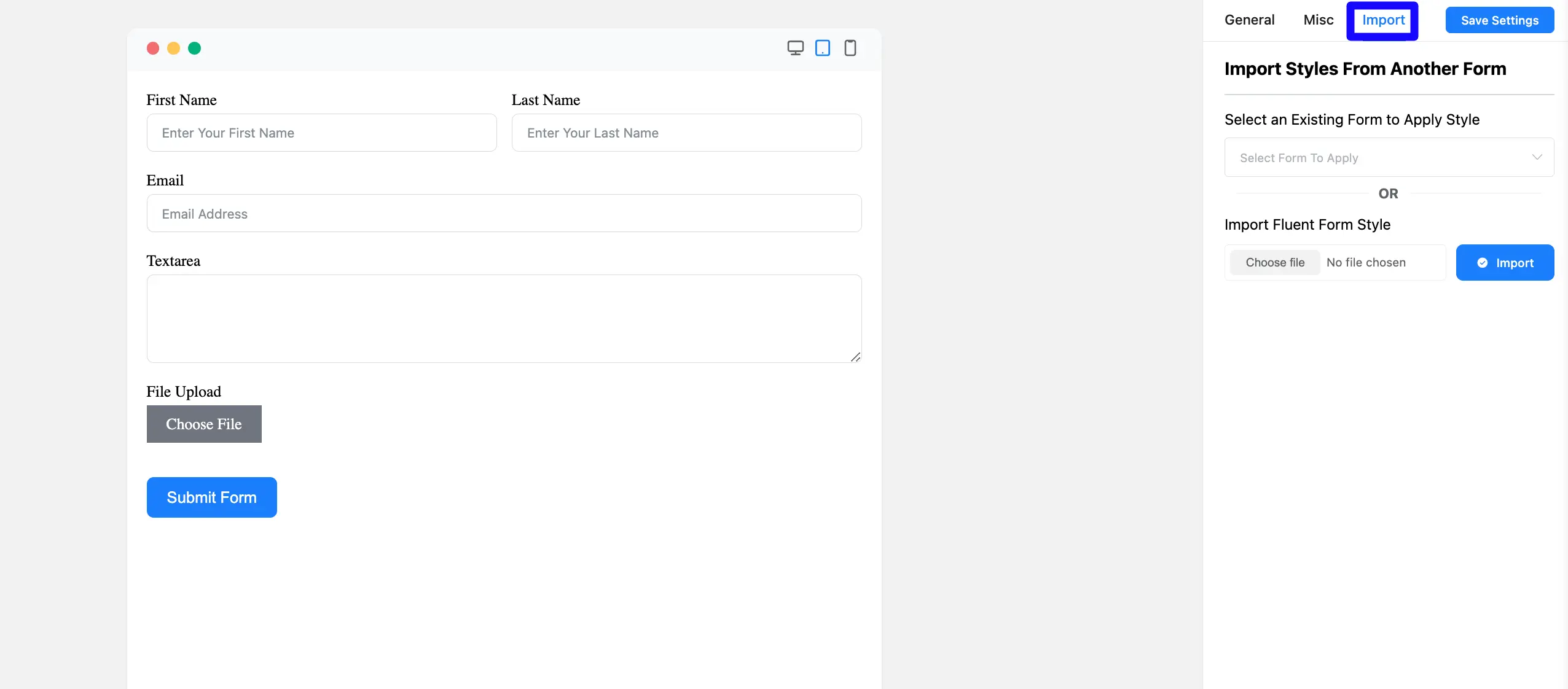
Import #
The Import tab selects a Fluent Form existing style add and can also import your style.
You can import your style from another Existing Form or Upload your Fluent form style.
If you have any further questions, concerns, or suggestions, please do not hesitate to contact our support team. Thank you.


