The Time & Date field in Fluent Forms allows users to select and submit date and time values. You can customize the date format, field behavior, and advanced options to match your needs.
This guide will walk you through adding and customizing the Time & Date Field in Fluent Forms for your WordPress site.
Adding Time & Date Field #
To add a Time & Date field to your form, follow these steps below-
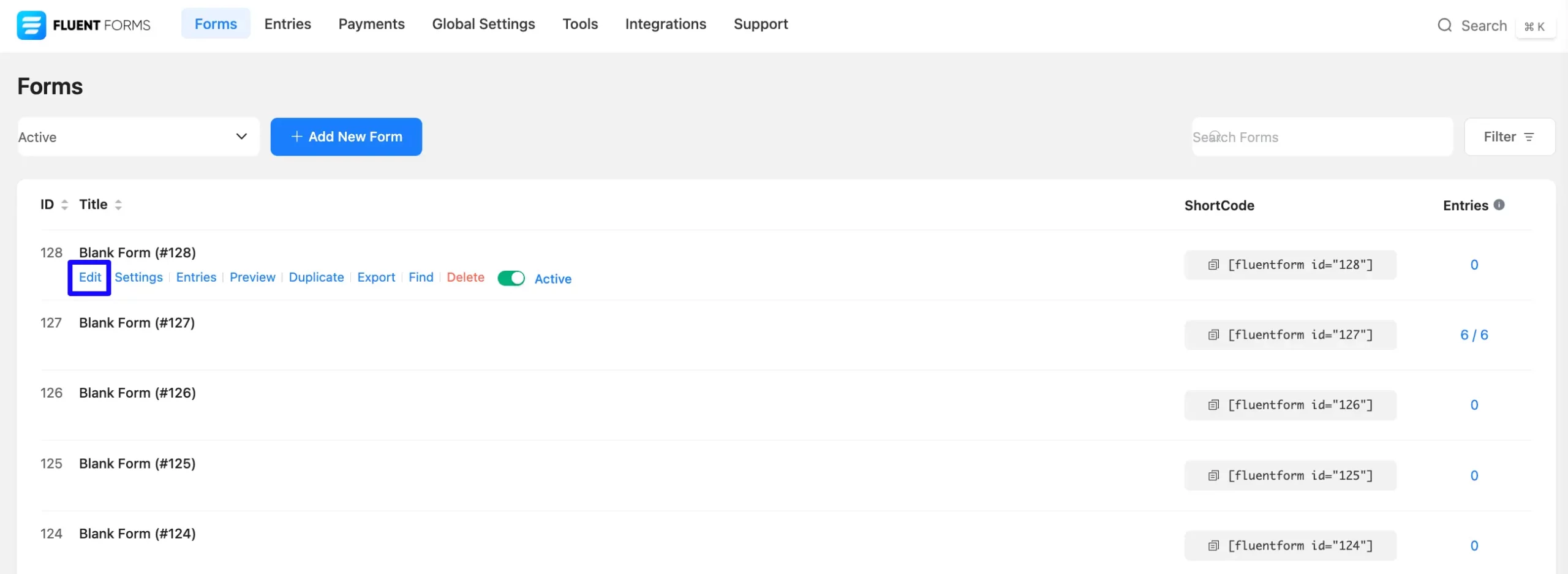
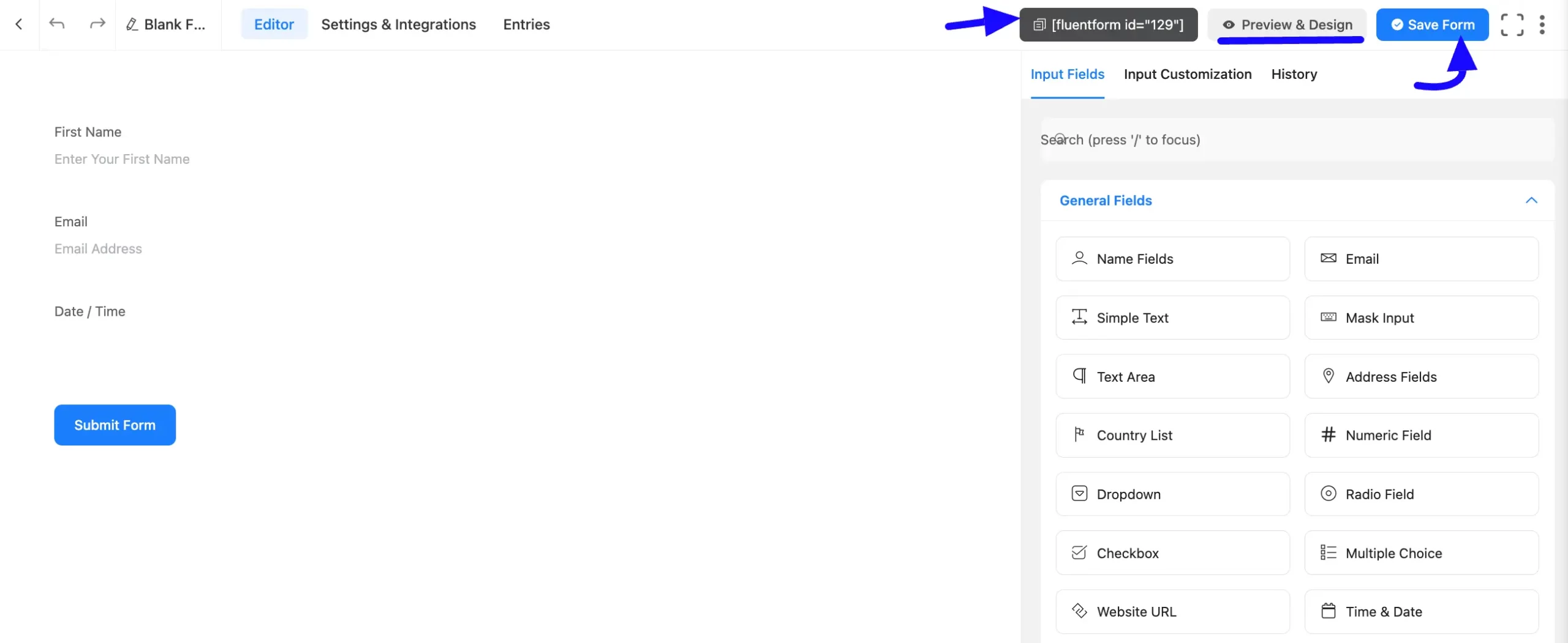
First, go to the Forms section from the Fluent Forms Navbar, choose a desired Form, and click the Edit icon to open the Editor page of that form.
If you do not have any existing forms, read Create a Form from Scratch or Create a Form using Templates documentation to create a new one.
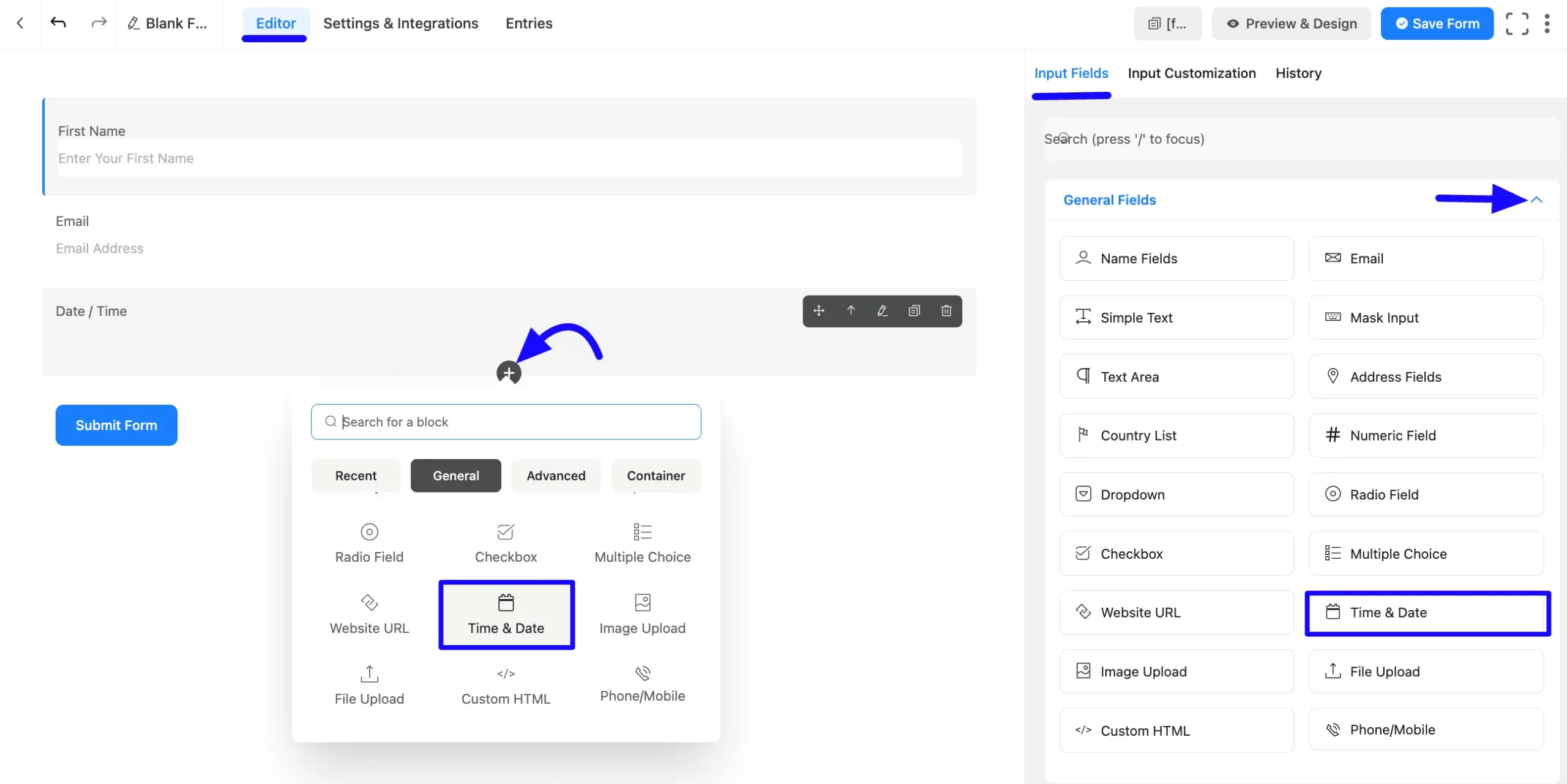
Once on the Editor page, click the Plus Icon in your form editor and open the General Fields module. The General Fields option is also in the right sidebar under the Input Fields tab.
Now, choose the desired Time & Date field by clicking or dragging and dropping it into your editor.
Customizing the Time & Date Field #
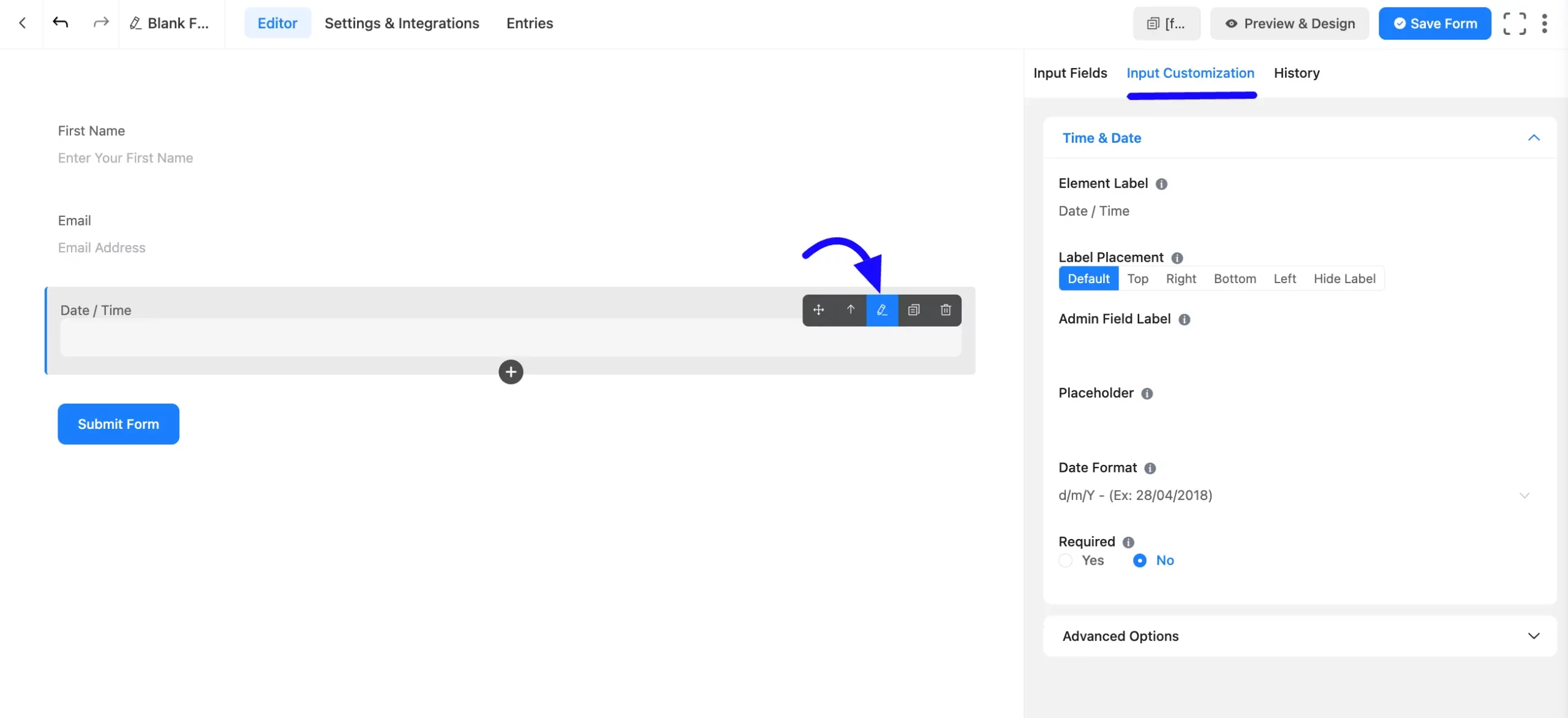
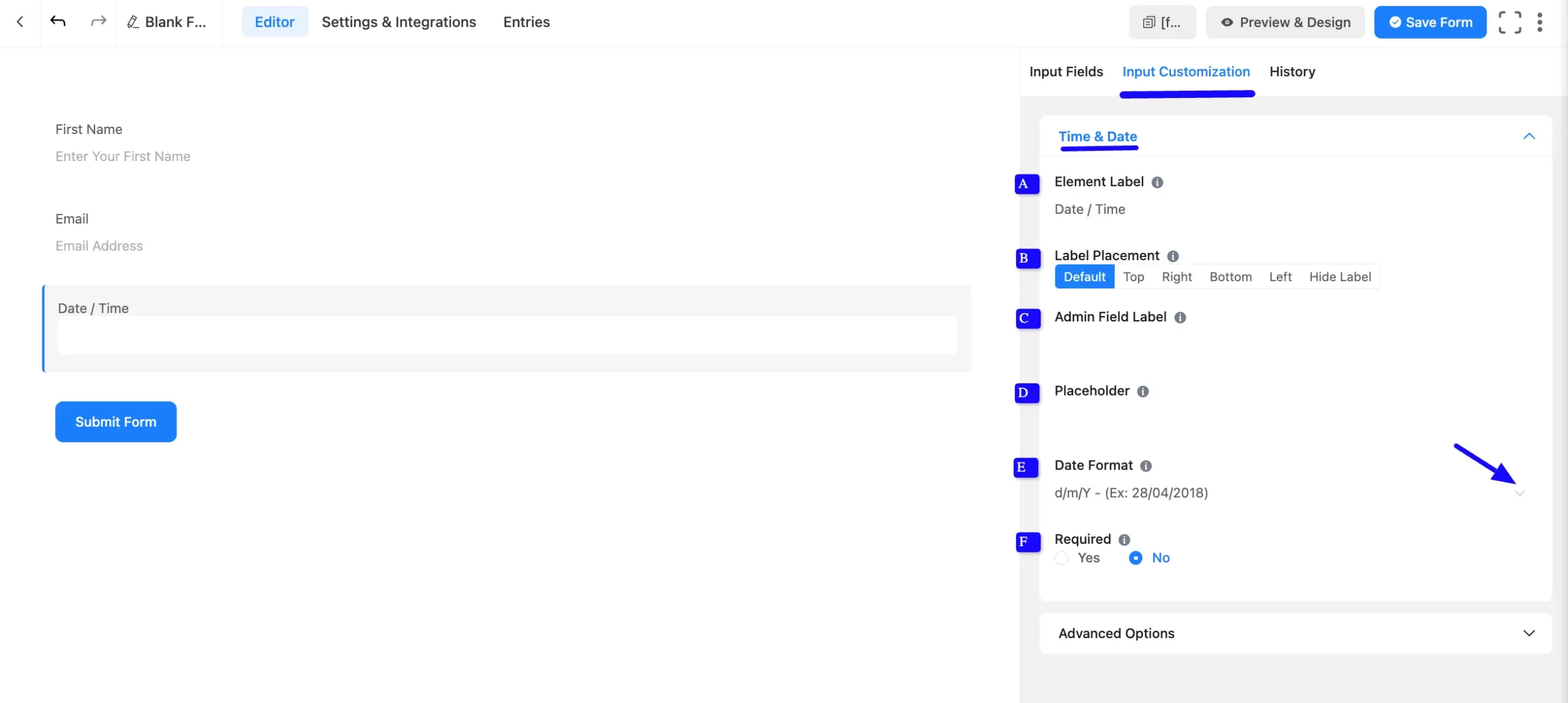
A Time & Date field has been added. You can edit this field by hovering over it and clicking the Pencil Icon. It will take you to the Input Customization tab on the right side and offer the following options for customizing the field.
- Time & Date Field Options
- Advanced Options
Time & Date Field options #
You will find various settings options for customizing the field. Located in the Input Customization Tab, these options allow you to configure essential aspects of the Time & Date input field.
All the Settings under the Time & Date Field mentioned above are briefly explained below –
A. Element Label: This is the field title users will see when filling out the Time & Date field in a form. You can enter any text here to help users understand the field’s purpose.
B. Label Placement: This option allows you to determine the position of the label title where the user will see it. The available options are Top, Left, Right, and Default. All of those are self-explanatory except the Default. If you select the Default option, it will represent your global label placement settings.
C. Admin Field Label: The admin field label is a field title displayed only to admin users. You can configure this option to show a different field label for your admin users when they view the form submissions.
D. Placeholder: When the input field is empty, a message is usually shown to the users so they can understand what the field expects from them. This is the equivalent of the HTML input placeholder attribute.
E. Date Format: The user can select a date in any date format from the drop-down menu.
F. Required: Choose the appropriate option from here to determine whether the field should be empty when the user submits your form.
Advanced Options #
Advanced settings allow further customization to meet specific use cases. All the Settings under the Advanced Options tab mentioned in the screenshot are briefly explained below –
A. Default Value: Using our shortcodes, you can manually set any fixed value in your field and pre-fill your input field dynamically. You can add default values with the Three-Dot option from the right side. Read this article to better understand Dynamic Default values.
B. Container Class: Use this option to add your custom CSS classes to the field’s wrapper.
C. Element Class: Add custom CSS classes to the input field.
D. Help Message: This option allows you to guide your user thoroughly. Add your text here, which will be shown as a help message to the user.
E. Name Attribute: The input field’s name attribute is the HTML equivalent of the same name. You don’t need to modify this.

F. Advanced Data Configuration: Fluent Forms uses the Flatpickr JavaScript library for the Date & Time Picker. Advanced users can modify field settings using custom configuration objects.
For instance, you can add the start of the week date. You can do this with the help of a custom code. By default, the week starts on Sunday. To set it to Monday, use this custom code given below:
{

    "locale": {

        "firstDayOfWeek": 1 // start week on Monday

    }

}
Available options
| Config Option | Type | Default | Description |
| altFormat | String | “F j, Y” | Exactly the same as date format, but for the altInput field |
| altInput | Boolean | false | Show the user a readable date (as per altFormat), but return something totally different to the server. |
| altInputClass | String | “” | This class will be added to the input element created by the altInput option. Note that altInput already inherits classes from the original input. |
| allowInput | Boolean | false | Allows the user to enter a date directly into the input field. By default, direct entry is disabled. |
| appendTo | HTMLElement | null | Instead of body, appends the calendar to the specified node instead*. |
| ariaDateFormat | String | “F j, Y” | Defines how the date will be formatted in the aria-label for calendar days, using the same tokens as dateFormat. If you change this, you should choose a value that will make sense if a screen reader reads it out loud. |
| clickOpens | Boolean | true | Whether clicking on the input should open the picker. You could disable this if you wish to open the calendar manually with.open() |
| dateFormat | String | “Y-m-d” | A string of characters which are used to define how the date will be displayed in the input box. The supported characters are defined in the table below. |
| defaultDate | String | null | Sets the initial selected date(s).If you’re using mode: “multiple” or a range calendar, supply an Array of Date objects or an Array of date strings which follow your dateFormat.Otherwise, you can supply a single Date object or a date string. |
| defaultHour | Number | 12 | Initial value of the hour element. |
| defaultMinute | Number | 0 | Initial value of the minute element. |
| disable | Array | [] | See Disabling dates |
| disableMobile | Boolean | false | Set disableMobile to true to always use the non-native picker.By default, flatpickr utilizes native datetime widgets unless certain options (e.g. disable) are used. |
| enable | Array | [] | See Enabling dates |
| enableTime | Boolean | false | Enables time picker |
| enableSeconds | Boolean | false | Enables seconds in the time picker. |
| formatDate | Function | null | Allows using a custom date formatting function instead of the built-in handling for date formats using dateFormat, altFormat, etc. |
| hourIncrement | Integer | 1 | Adjusts the step for the hour input (incl. scrolling) |
| inline | Boolean | false | Displays the calendar inline |
| maxDate | String/Date | null | The maximum date that a user can pick to (inclusive). |
| minDate | String/Date | null | The minimum date that a user can start picking from (inclusive). |
| minuteIncrement | Integer | 5 | Adjusts the step for the minute input (incl. scrolling) |
| mode | String | “single” | “single”, “multiple”, or “range” |
| nextArrow | String | > | HTML for the arrow icon, used to switch months. |
| noCalendar | Boolean | false | Hides the day selection in the calendar.Use it along with enableTime to create a time picker. |
| onChange | Function, [functions] | null | Function(s) to trigger on every date selection. See Events API |
| onClose | Function, [functions] | null | Function(s) to trigger on every time the calendar is closed. See Events API |
| onOpen | Function, [functions] | null | Function(s) to trigger on every time the calendar is opened. See Events API |
| onReady | Function, [functions] | null | Function to trigger when the calendar is ready. See Events API |
| parseDate | Function | false | Function that expects a date string and must return a Date object |
| position | String | “auto” | Where the calendar is rendered relative to the input. “auto”, “above” or “below” |
| prevArrow | String | < | HTML for the left arrow icon. |
| shorthandCurrentMonth | Boolean | false | Show the month using the shorthand version (ie, Sep instead of September). |
| showMonths | Integer | 1 | The number of months showed. |
| static | Boolean | false | Position the calendar inside the wrapper and next to the input element*. |
| time_24hr | boolean | false | Displays time picker in 24 hour mode without AM/PM selection when enabled. |
| weekNumbers | Boolean | false | Enables display of week numbers in calendar. |
| wrap | Boolean | false | Custom elements and input groups |
If you want to know more read this Flatpickr documentation.
F. Conditional Logic: This option allows you to create specific rules to dynamically hide/show the input field to function conditionally based on your submission values according to your set of conditional logics. To learn more, read this Documentation.
Embedding the Forms on your Website #
Once you complete the customization, click the Save Form button to save all your changes. Click the Preview & Design button in the middle to see the form preview.
To integrate and display the form on a specific page or post, copy the Shortcode from the top right side and paste it into your desired Page or Post.
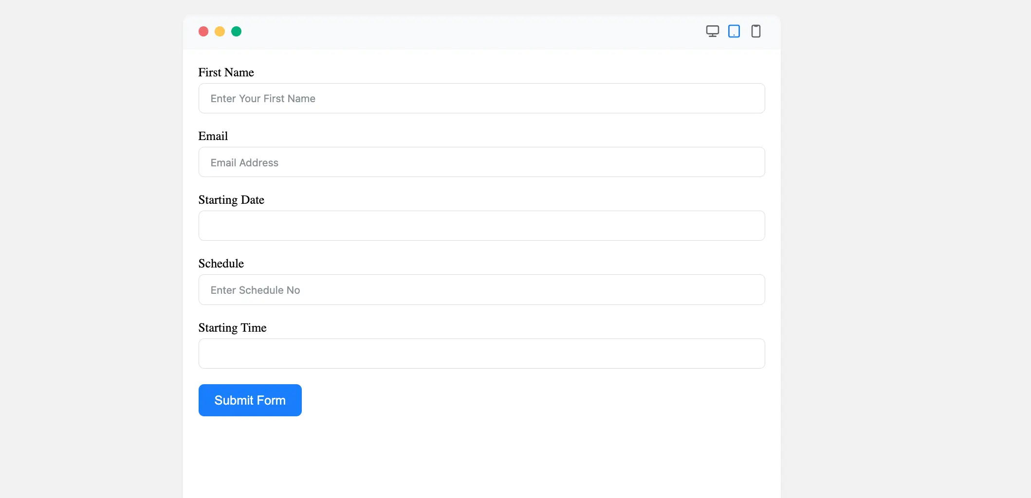
Preview of Added Time & Date Field #
Here is the preview of the added Time & Date field under the Form.
Congratulations! You have successfully added a Time & Date field to your Fluent Form.
If you have any further questions, concerns, or suggestions, please do not hesitate to contact our support team. Thank you.


