In Fluent Forms, the Featured Image field allows you to offer your users the option of submitting the media file to their post. This article will guide you through the whole process of adding the Featured Image field in your Fluent Forms for your WordPress Site.
Add Featured Image Field #
To learn how to add the Featured Image field to the Post Forms in Fluent Forms, follow the steps with the screenshots below –
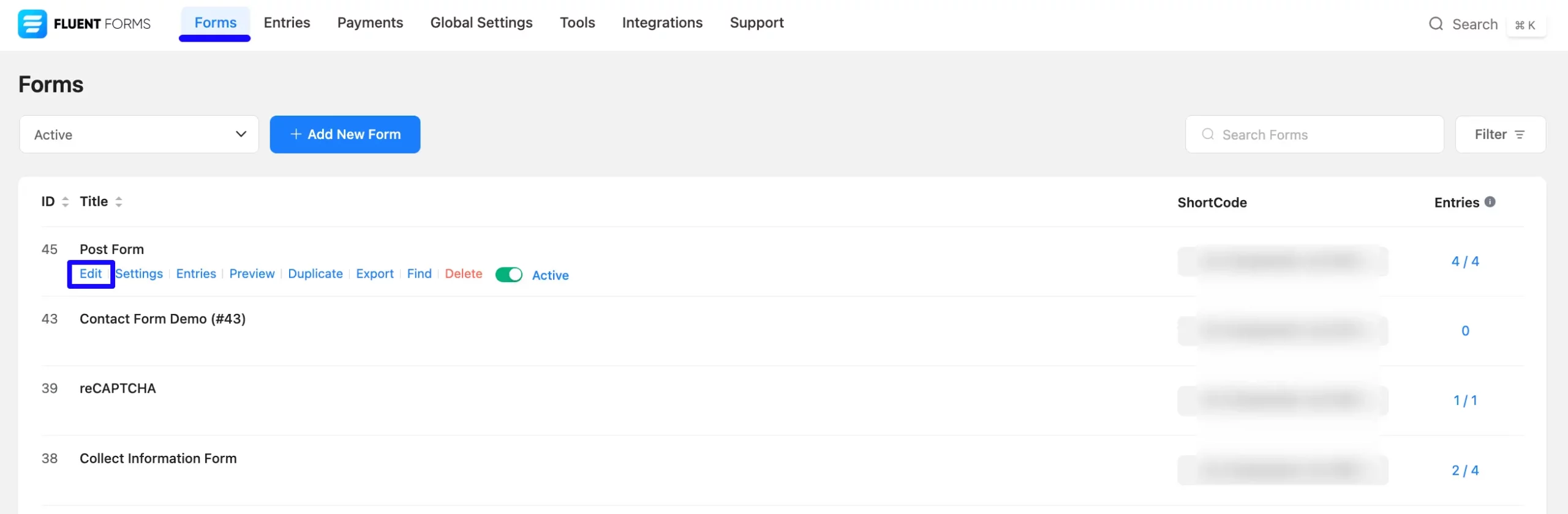
First, go to the Forms section from the Fluent Forms Navbar, choose a desired Post Form, and click the Pencil/Edit icon to open the Editor page of that form.
If you don’t have an existing Post Form, read this Documentation to create a new one. For example, I choose an existing Post Form to show the whole process. Remember, you will get the Featured Image field only under the Post Forms.
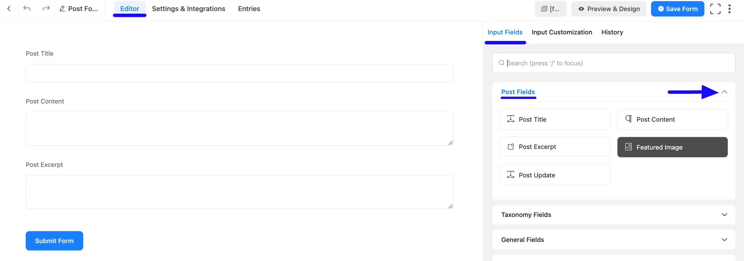
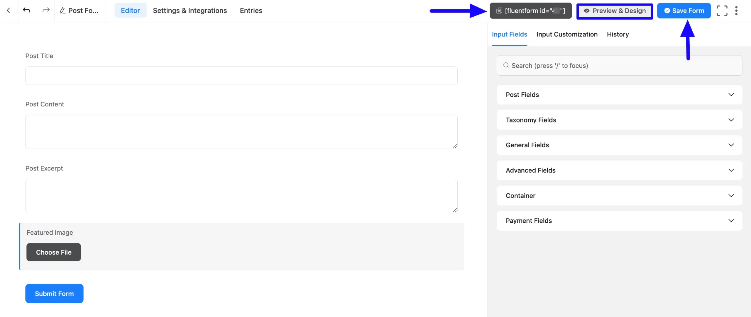
Once you are on the Editor page, go to the Input Fields on the right sidebar and open the Post Fields dropdown list by clicking the Arrow Icon. Now, choose the Featured Image field by clicking on it or Drag & Drop it into your editor.
Customize Featured Image Field #
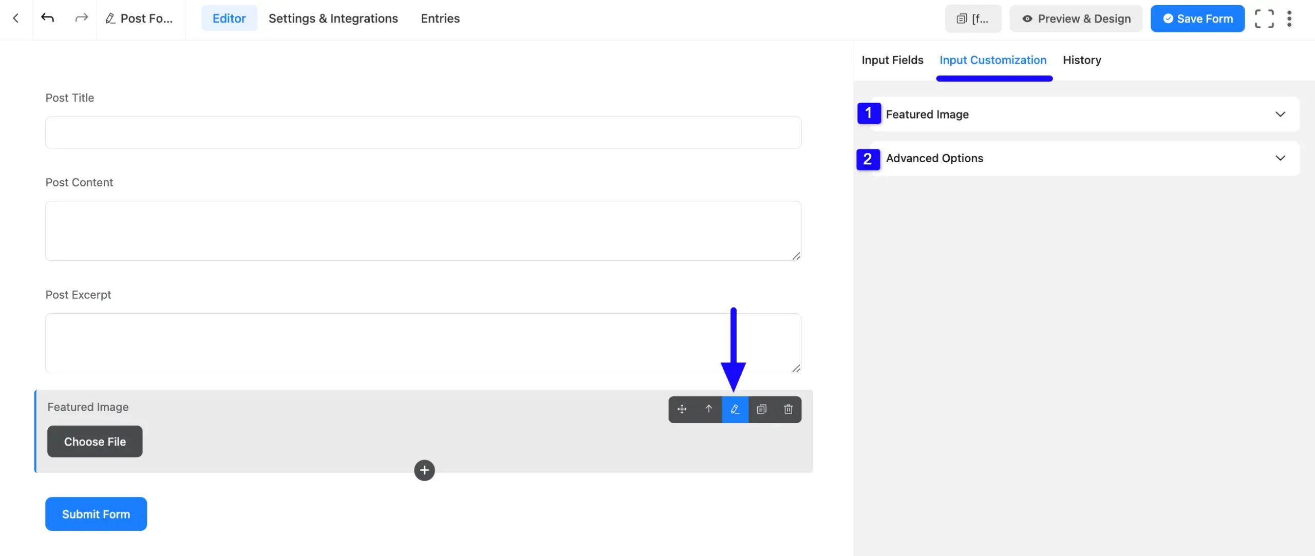
You can see that a Featured Image field is added to the form. You can Edit or Customize this field by hovering over it and clicking the Pencil Icon.
It will take you to the Input Customization tab on the right side and offer you the following options for customizing the field.
- Featured Image
- Advanced Options
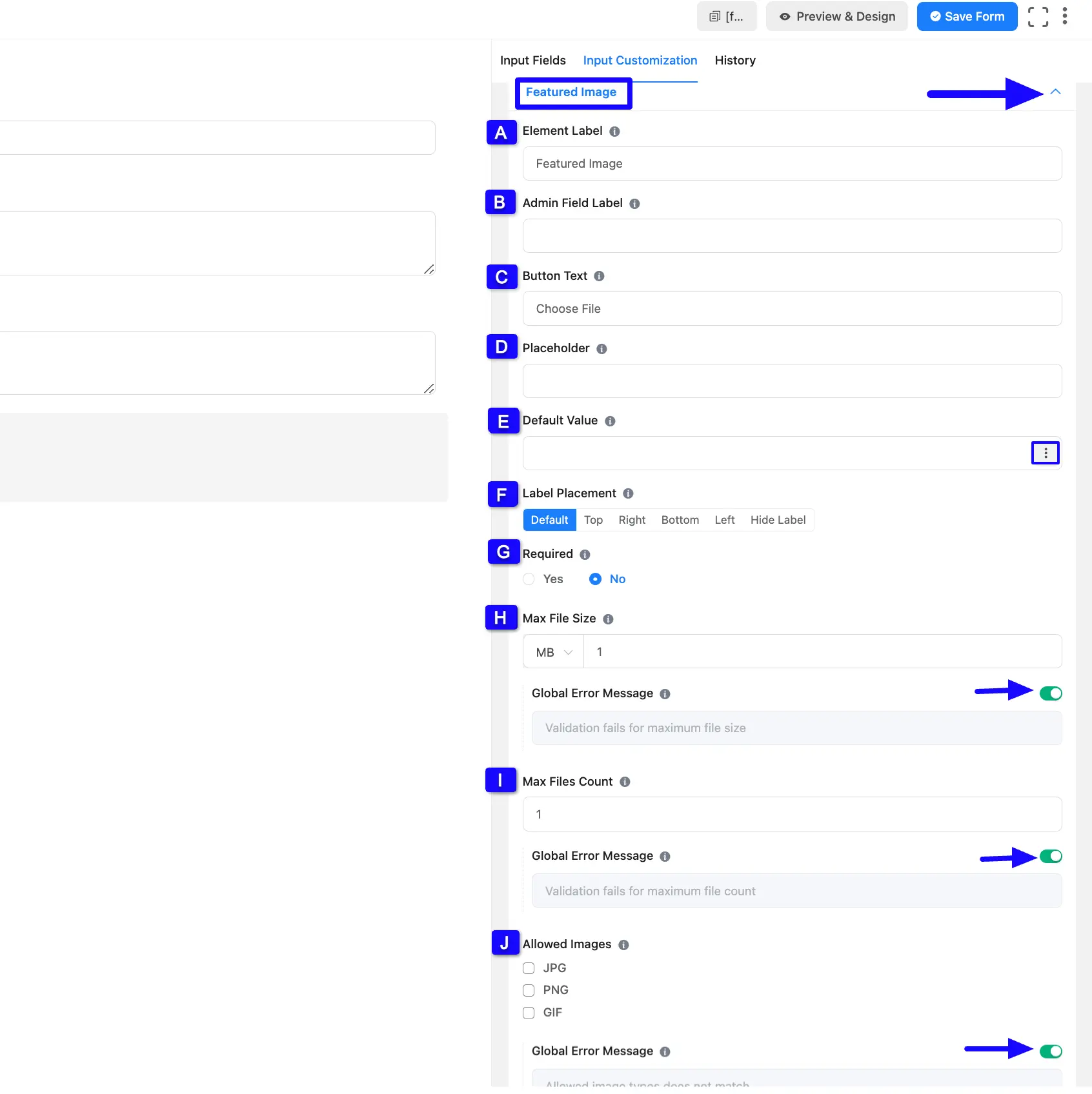
1. Featured Image #
All the Settings under the Featured Image tab mentioned in the screenshot are briefly explained below –
A. Element Label: This is the field content the users will see when filling out the Post Content field in a form. You can enter any text here to help users understand the purpose of the field.
B. Admin Field Label: The admin field label is a field Content displayed only to admin users. That means, if you want to show a different field label for your admin users when they view the form submissions, you can configure that using this option.
C. Button Text: This is the content that will be visible as button text for uploading files.
D. Placeholder: Here, you can set a desired text to guide your users about the purpose of the field. It is the equivalent of the HTML input placeholder attribute. The user will see this text when the input field is empty.
E. Default Value: You can set a default value here to pre-populate the value of a field and enter it here. You can also set the value by using the SamrtCode. To learn the details about SmartCodes, read this Documentation.
F. Label Placement: Using this option, you can determine the position of the label Content where the user will see this. The available options are Top, Right, Bottom, Left, Hide Label, and Default All of those are self-explanatory except the Default. If you select the Default option, it will represent your global label placement settings.
G. Required: Select the Yes radio button to make this field mandatory for users to fill in for successful form submission. Otherwise, check the No radio button to keep this field optional to fill in.
H. Max File Size: Here, you can set the maximum file size a user can upload. You can also enable the Global Error Message option and enter a message that will be shown to users when an error occurs.
I. Max Files Count: Here, you can set the maximum file a user can upload. You can also enable the Global Error Message option and enter a message that will be shown to users when an error occurs.
J. Allowed Images: Here you can select in which format you want your users to upload the file.
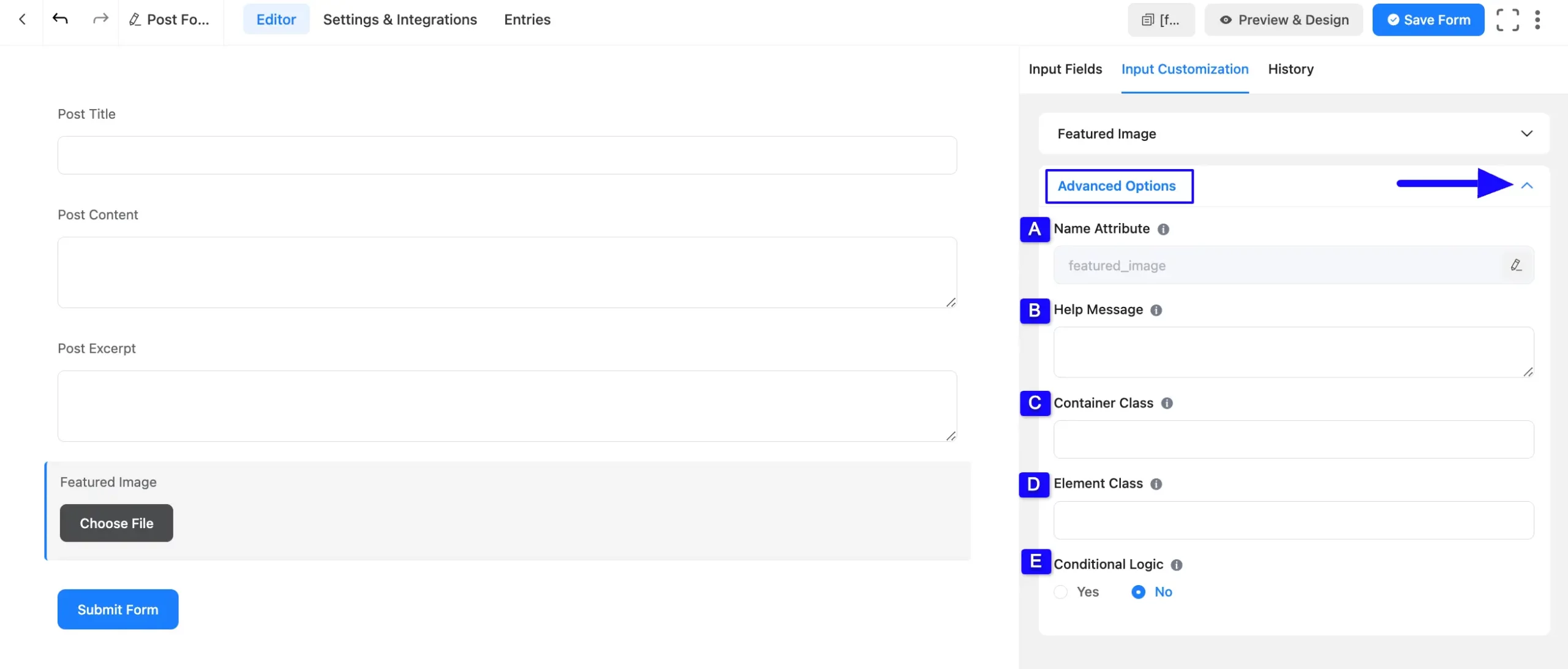
2. Advanced Options #
All the Settings under the Advanced Options tab mentioned in the screenshot are briefly explained below –
A. Name Attribute: The input field’s name attribute is the HTML equivalent of the same name. You don’t need to modify this.
B. Help Message: You can use this option to guide your user thoroughly. Add your text here, which will be shown as a help message to the user. To learn more, read this Documentation.
C. Container Class: Use this option to add your custom CSS classes to the field’s wrapper.
D. Element Class: Add custom CSS classes to the input field itself. This is used for adding Custom CSS/JS for a specific input field of a form.
E. Conditional Logic: This option allows the coupon field to function conditionally based on your submission values according to your set of conditional logic/s. To learn more, read this Documentation.
Configure Post Feed Settings #
Lastly, configuring the Post Feed is mandatory to make your Post Form functional. It helps you map your added post fields for data collection and allows users to create more customized posts.
Click here to learn how to configure Post Feed with the Post Form.
Embed the Form into Frontend #
To embed and display the form on a specific Page/Post on your site, copy the Shortcode from the top right side and paste it into your desired Page/Post.
Once you complete the customization, click the Save Form button to save all your changes. Also, to see the form preview, click the Preview & Design button in the middle.
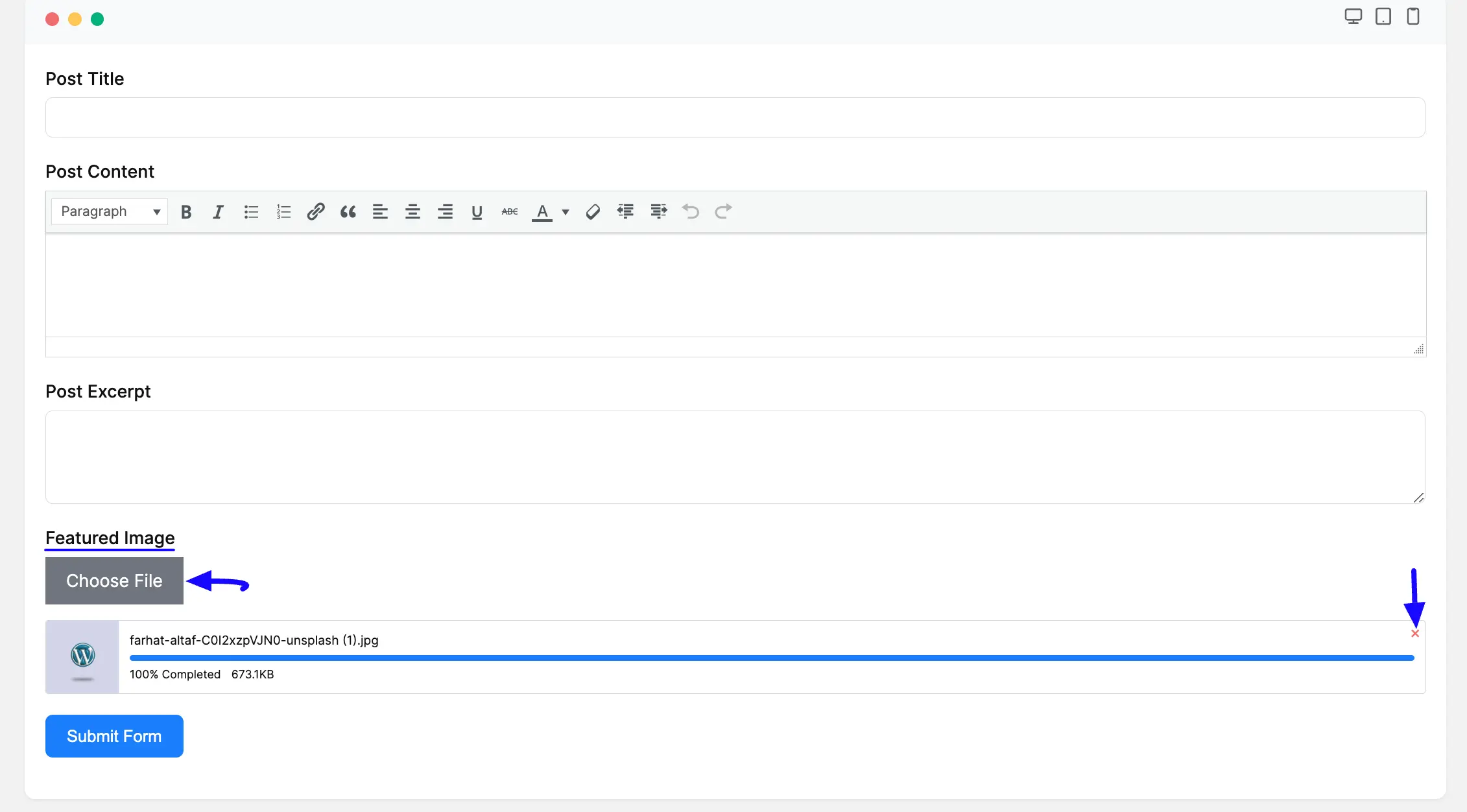
Preview of Featured Image field #
Here is the preview of the added Featured Image field under the Post Form.
Now, you can add the desired file by clicking the Choose File button. Plus, you can delete the uploaded file if needed by clicking the Cross Icon in the left corner.
This way you can easily add the Featured Image fields in Fluent Forms!
If you have any further questions, concerns, or suggestions, please do not hesitate to contact our @support team. Thank you.


