
The Ranking field in Fluent Forms allows users to provide feedback by arranging options in their preferred order. By default, the field includes options that users can easily reorder using drag-and-drop handles or up/down arrows. You can customize the layout, add photos to the options, and define as many ranking choices as needed.
This guide will walk you through adding and customizing the Ranking Field in Fluent Forms for your WordPress site.
Note: The Ranking field is an advanced feature of the Fluent Forms plugin. To use it, you require the Fluent Forms Pro Add-on.
Adding the Ranking Field #
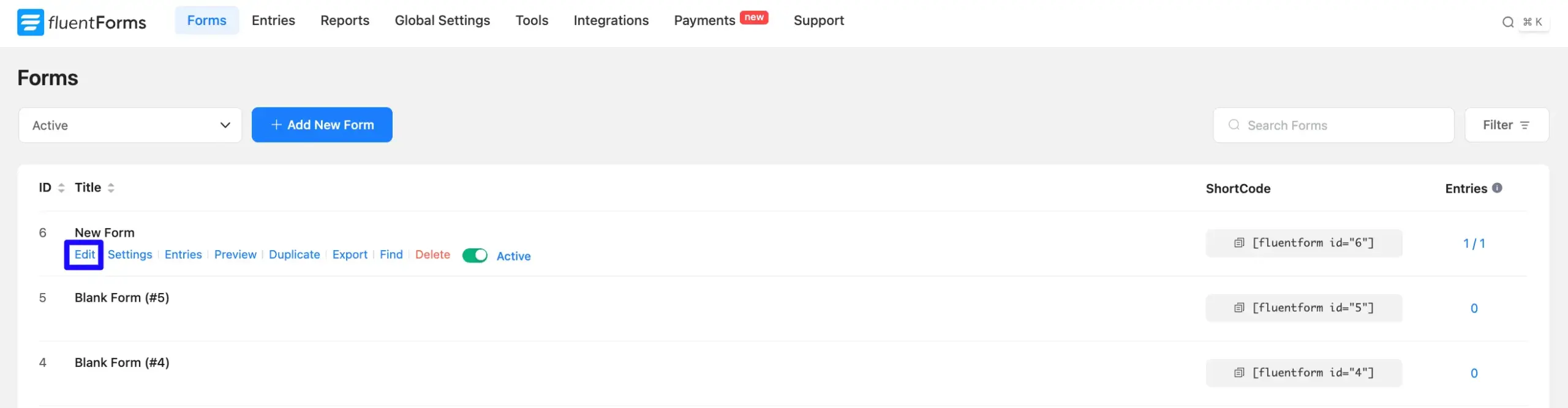
- Go to the Forms section from the Fluent Forms Navbar, choose a desired Form, and click the Edit link to open the Editor page of that form.
Note: If you do not have any existing forms, read Create a Form from Scratch or Create a Form using Templates documentation to create a new one.
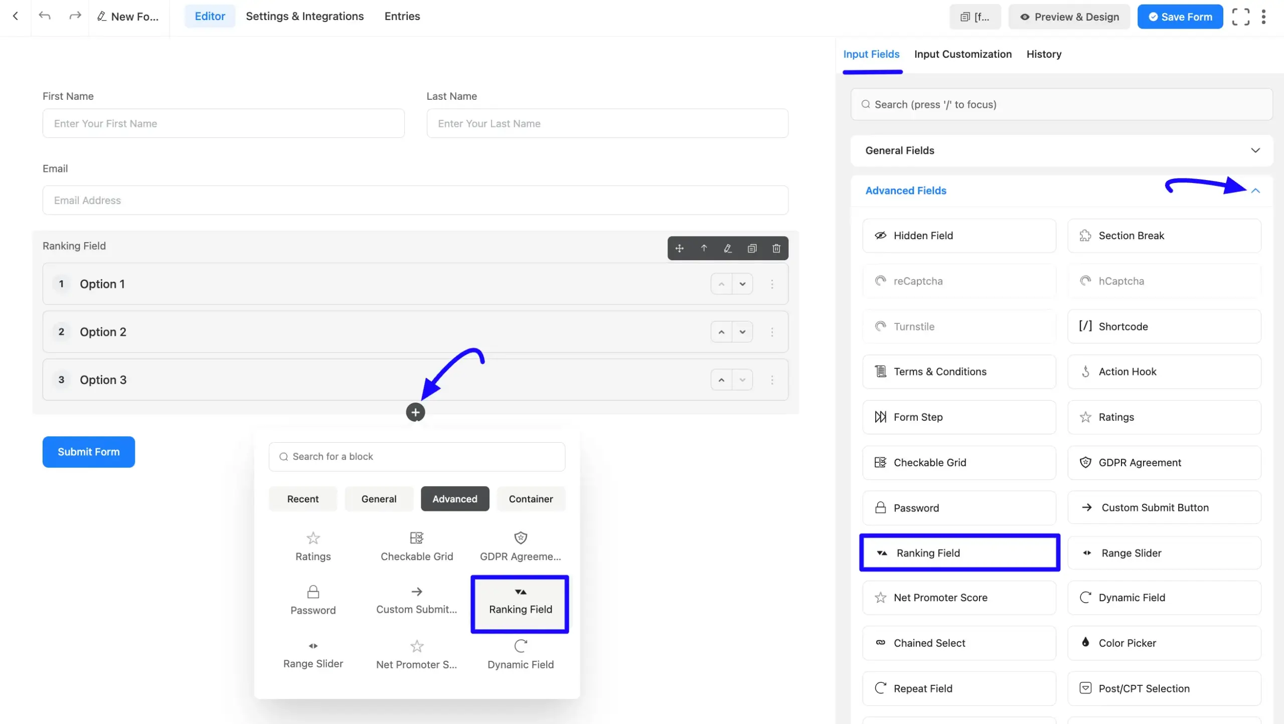
- Once you are on the Editor page, click the Plus Icon in your form editor and open the Advanced Fields module.
- Now, select the Ranking Field by clicking on it or dragging and dropping it into your editor.
Customizing the Ranking Field #
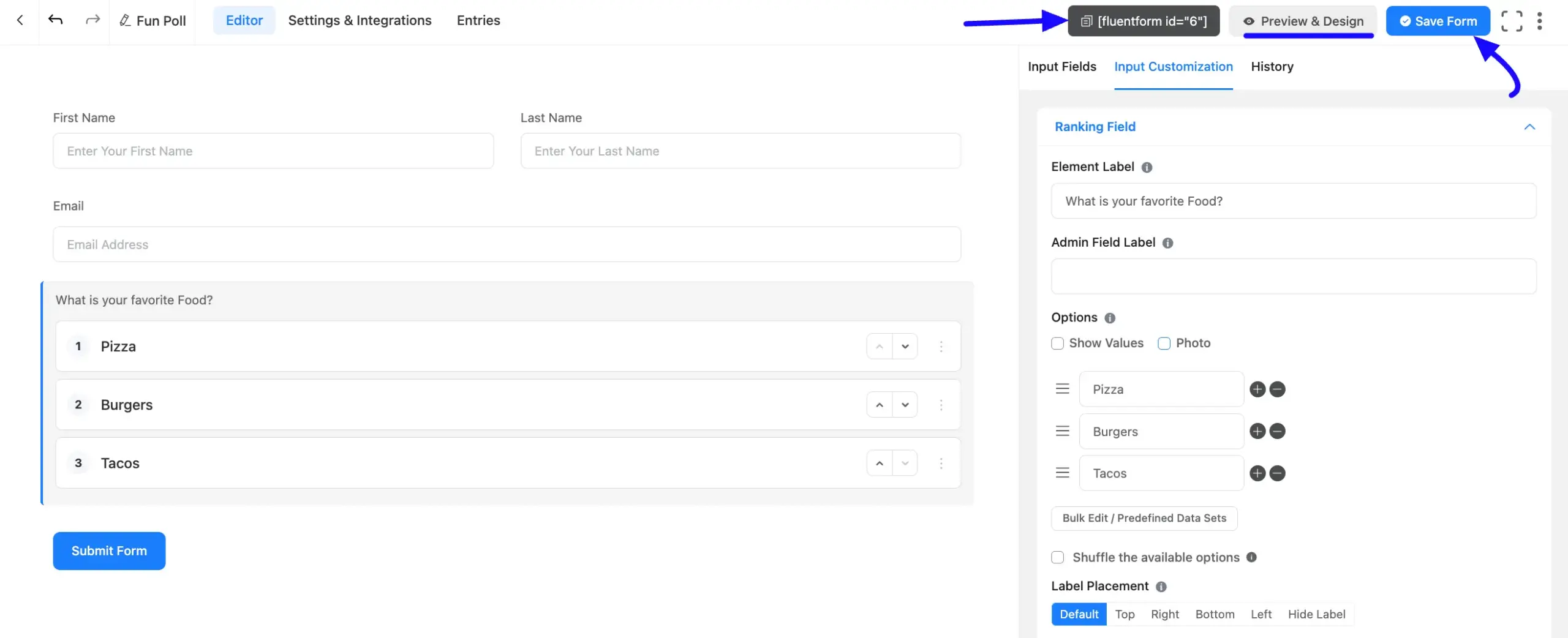
A Ranking field has been added. You can edit this field by hovering over it and clicking the Pencil Icon to open the Input Customization tab on the right side.
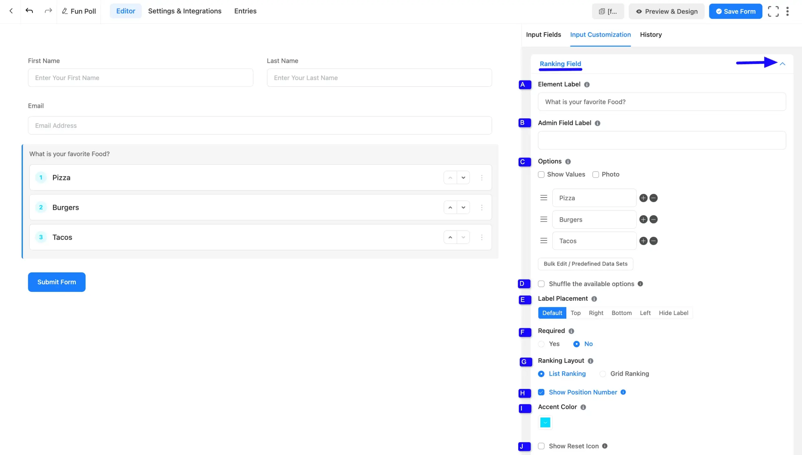
Ranking Field Options #
Located in the Input Customization Tab, these options allow you to configure essential aspects of the Ranking field:
A. Element Label: This is the field title that the users will see when filling out the Ranking field in a form. You can enter any text here to help users understand the purpose of the field.
B. Admin Field Label: The admin field label is a field title displayed only to admin users. You can configure this option to show a different field label for your admin users when they view the form submissions.
C. Options: In this Options section, you can customize the rankable choices:
- Rename the individual option levels.
- Add new options by clicking the Plus (+) icon.
- Remove options using the Minus (-) icon.
- Check the Show Values option to handle backend values or the Photo option to display images alongside the text. You can directly upload the photo option when you check this. Also, you can show value and photo at the same time.
- Edit in bulk or use predefined data sets by clicking the Bulk Edit / Predefined Data Sets button.
D. Shuffle the available options: Check this box to randomize the initial order of the choices when the user loads the form.
E. Label Placement: This option allows you to determine the position of the label title. The available options are Top, Right, Bottom, Left, Hide Label, and Default.
F. Required: Decide whether users must complete this ranking field before submission.
G. Ranking Layout: Choose how the options are visually presented to the user:
- List Ranking: Displays the rankable options in a standard vertical list.
- Grid Ranking: Displays the options in a horizontal grid formation. When selected, a Grid Columns dropdown appears, allowing you to specify the number of columns (e.g.,
H. Show Position Number: Enable this checkbox to display a numbered badge next to each option (e.g., 1, 2, 3), helping users visualize the numerical rank they are assigning.
I. Accent Color: Click the color swatch box to choose a custom color for the position number badges, allowing you to match the field to your brand’s design.
J. Show Reset Icon: Enable this option to provide a button for users to easily clear their ranking selections and start over.
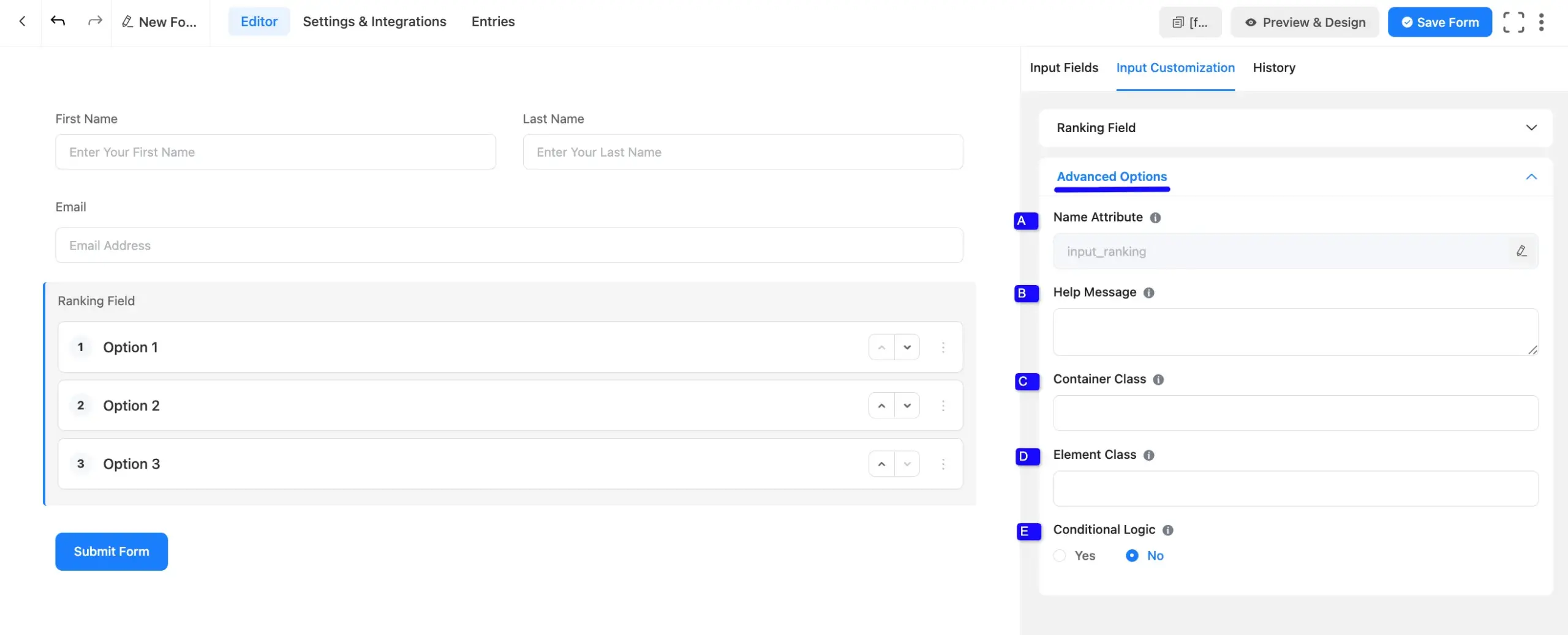
Advanced Options #
Advanced settings allow further customization to meet specific use cases. All the Settings under the Advanced Options tab are briefly explained below:
A. Name Attribute: The input field’s name attribute is the HTML equivalent of the same name. You don’t need to modify this.
B. Help Message: This option allows you to guide your user thoroughly. Add your text here, which will be shown as a help message to the user.
C. Container Class: Use this option to add your custom CSS classes to the field’s wrapper.
D. Element Class: Add custom CSS classes to the input field itself.
E. Conditional Logic: This option allows you to create specific rules to dynamically hide/show the input field to function conditionally based on your submission values according to your set of conditional logics.
Embed the Form into the Front #
Once you have customized the ranking field, click the Save Form button in the top right to apply the changes.
To display the form on a specific page or post, copy the Shortcode from the Forms list and paste it into your desired page or post. To preview the form, click Preview & Design at the top of the editor page.
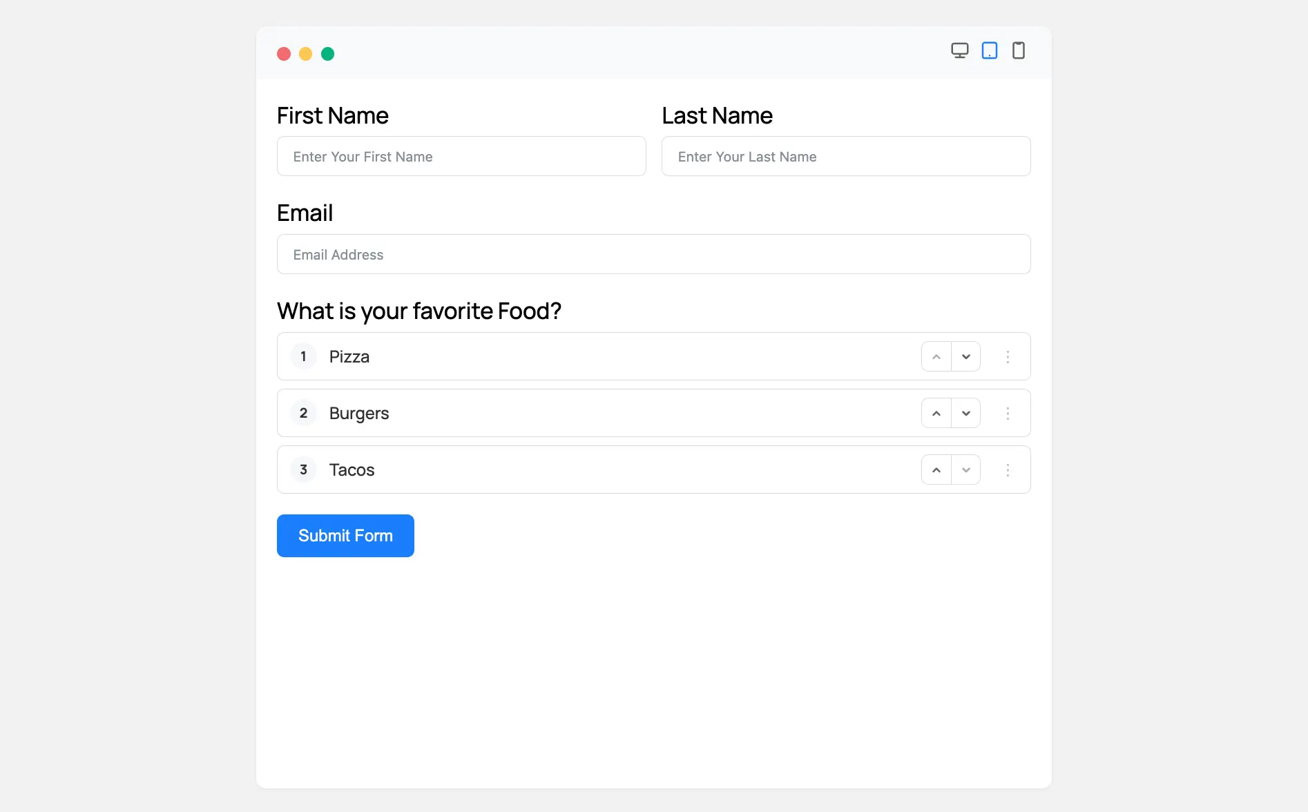
Preview of Added Ranking Field #
Here is a preview of the form with the Ranking Field active:
Users can interact with the numbered options by using the up and down arrows or by grabbing the drag handles on the right side of the box to reorder them.
Congratulations! You have successfully added a Ranking field to your Fluent Forms form.


